OBJECTIVE
To develop a visual system and campaign that can be implemented into multiple formats. To communicate the event information clearly. Organize information into a clear and recognizable hierarchy.
Wordmark Typeface Choice

First, a typeface was selected for the wordmark. The typeface Whomp was selected as it had character and a free-flowing style that fit well with a music festival that encouraged a wide range of styles and expression.
Wordmark Process Gif
A series of edits were made to the word "Amplify" to make it a better wordmark and provide a cohesive feeling throughout the word.
Final Wordmark

The final wordmark put emphasis on sharper points on the ends of the A, M, and P transitioning into thick, flowing strokes. The y was extended to provide a base to the word and underline part of it. Most of the characters were connected to hint at the interweaving of music, musicians, and genres.
Poster Iterations
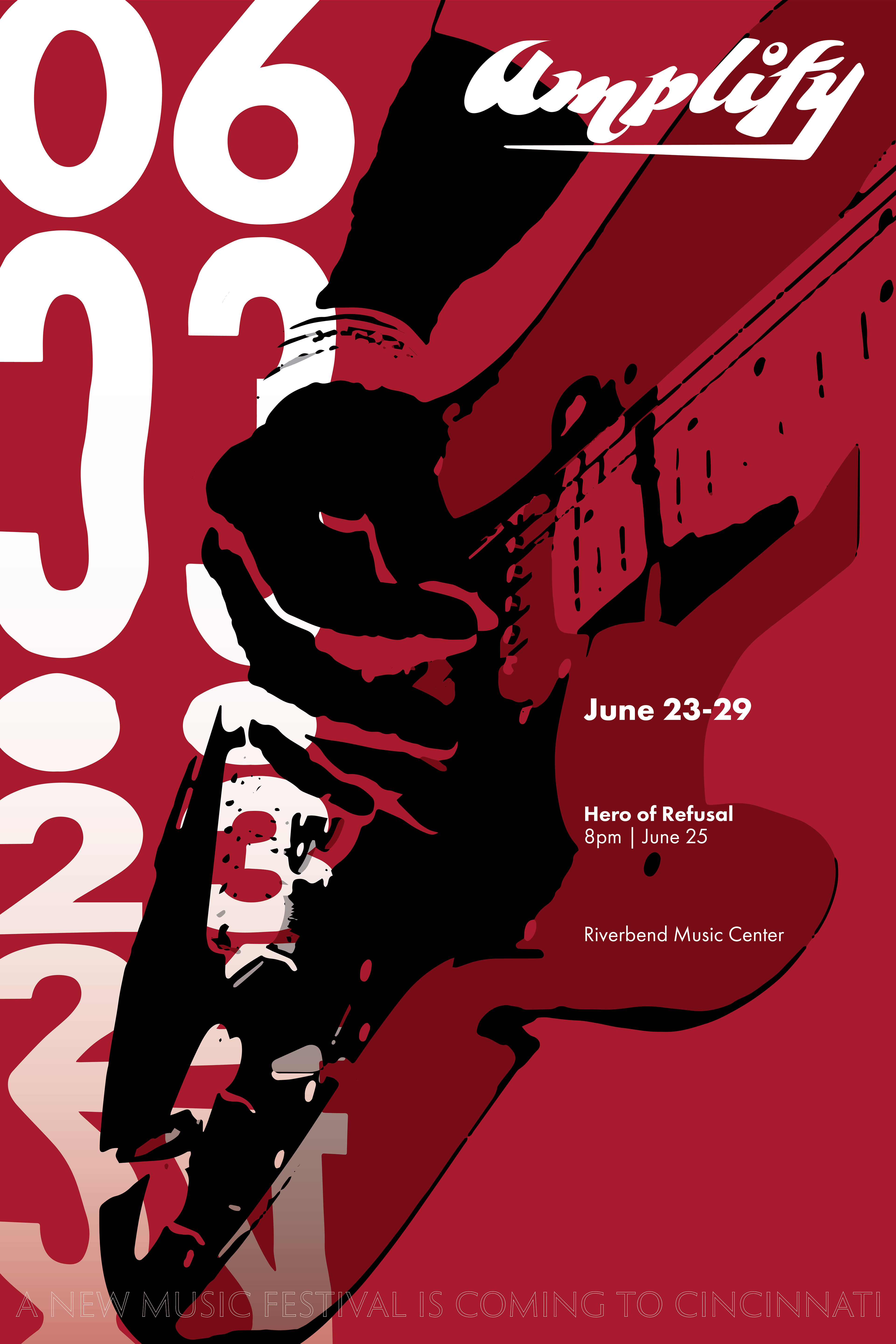
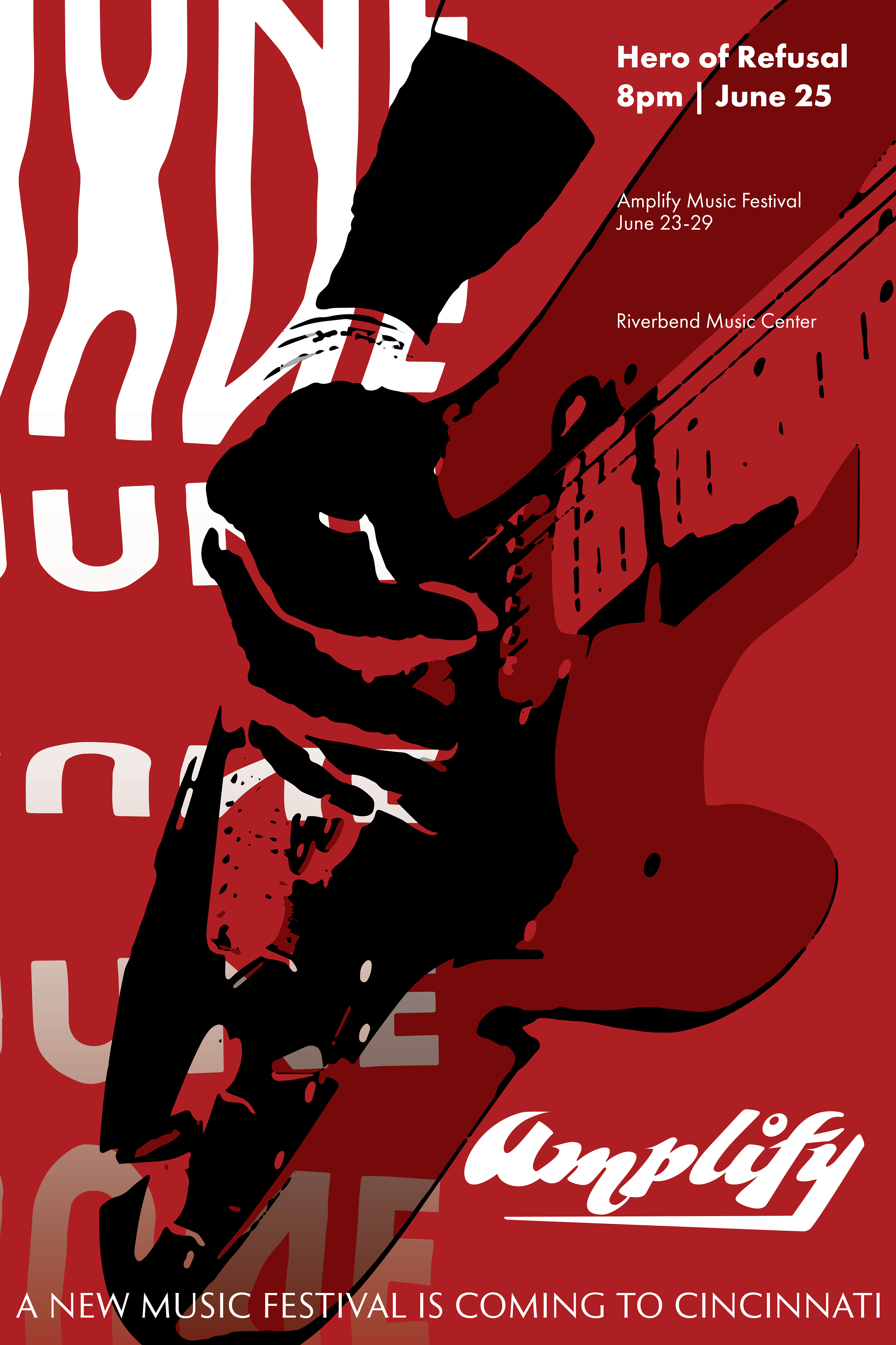
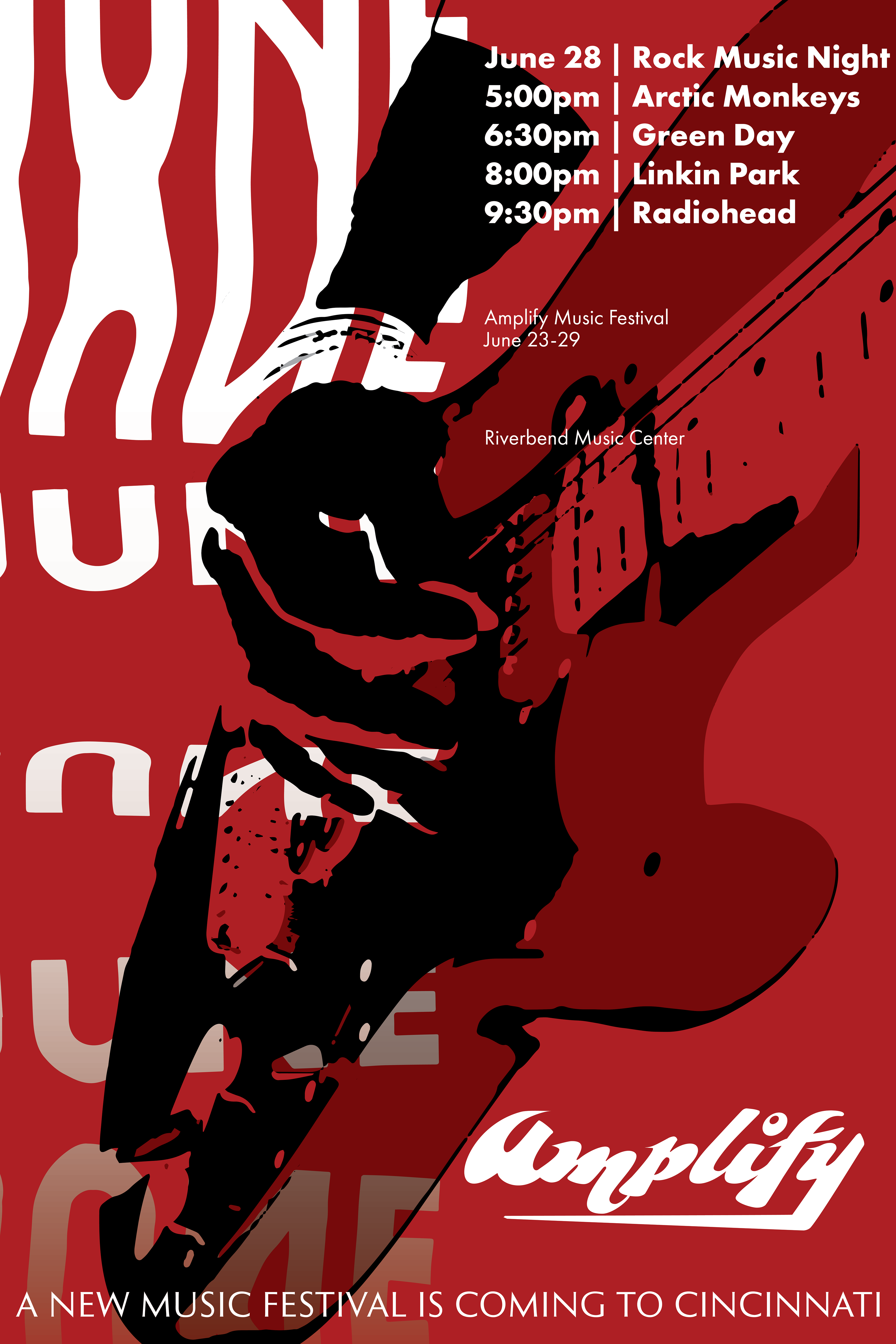
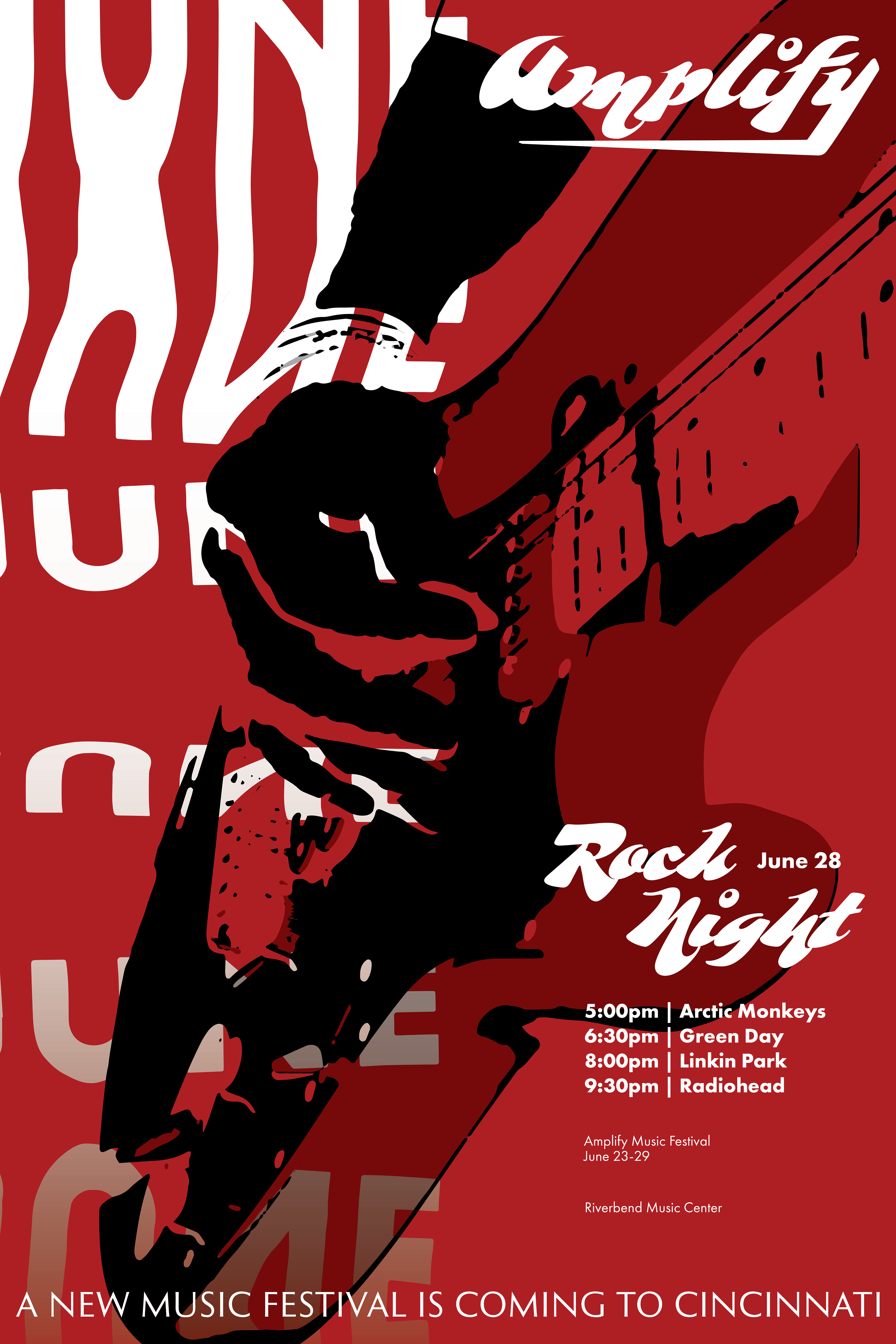
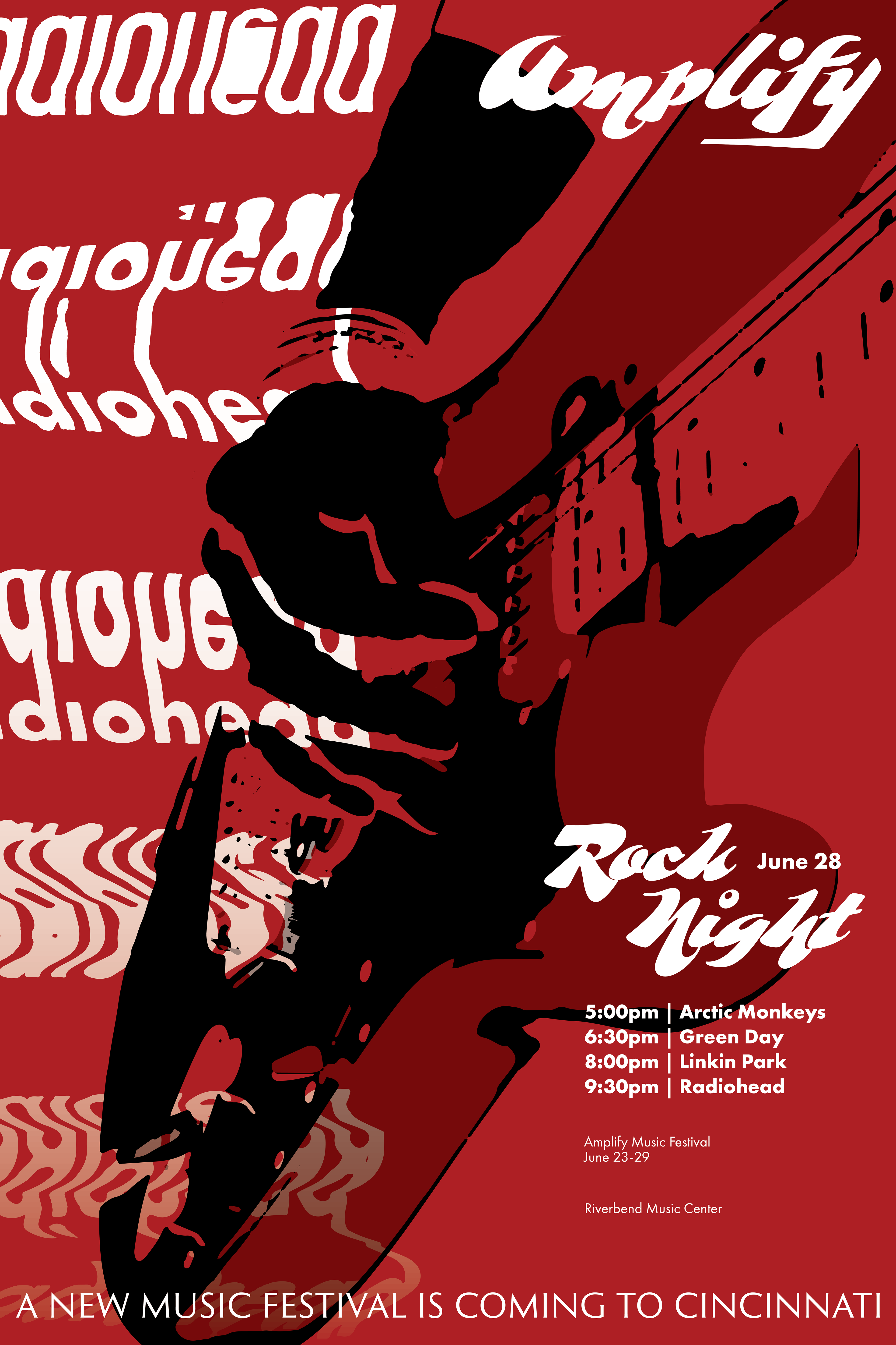
Following the wordmark, posters were created to advertise the event and provide a wider scope for the branding campaign. Combining elements of intense imagery, stretched text, and vibrant color allowed for eye-catching posters. The first poster was iterated upon until reaching a point that captured attention and conveyed the necessary information before transitioning to the rest of the series.
Final Poster Series
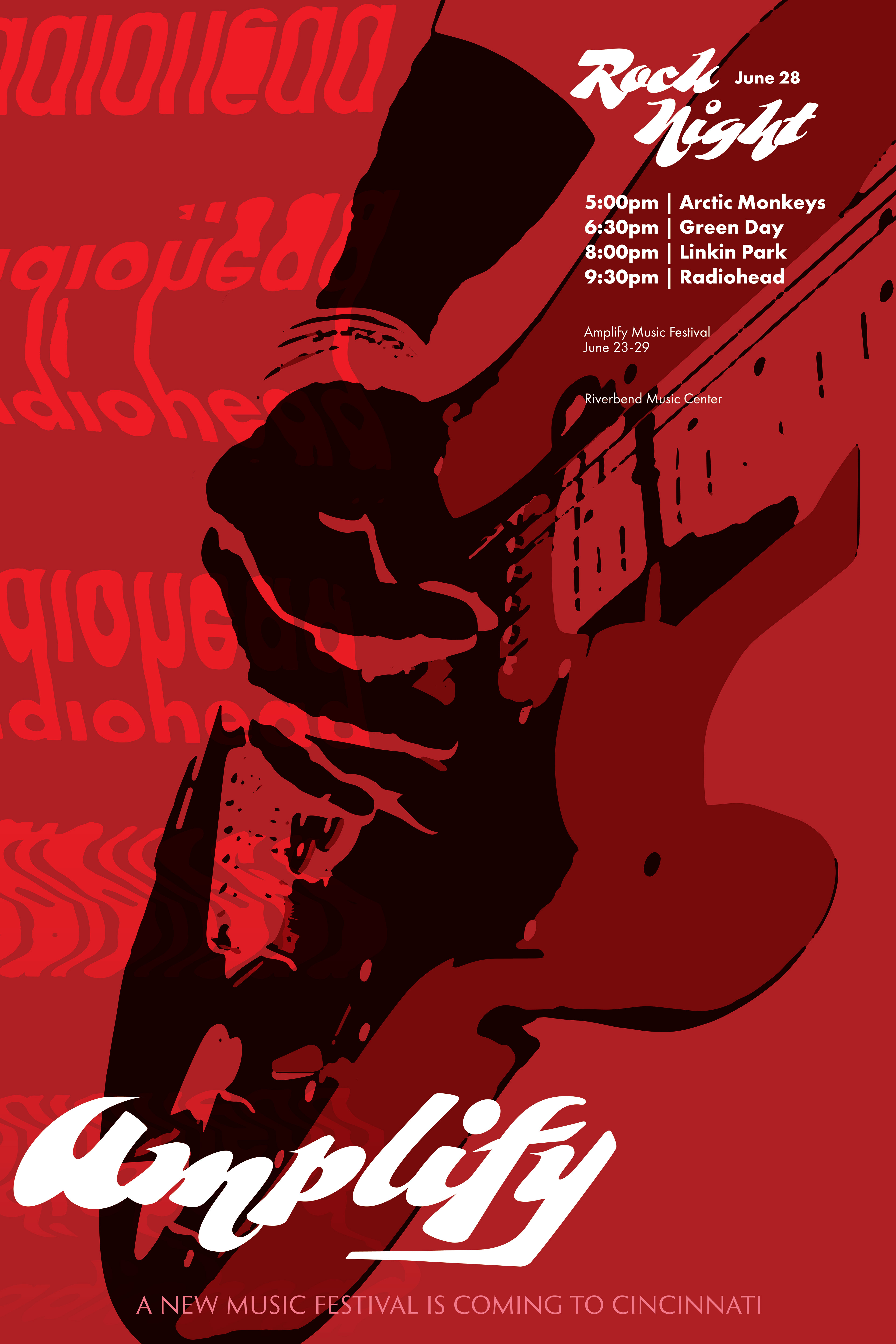
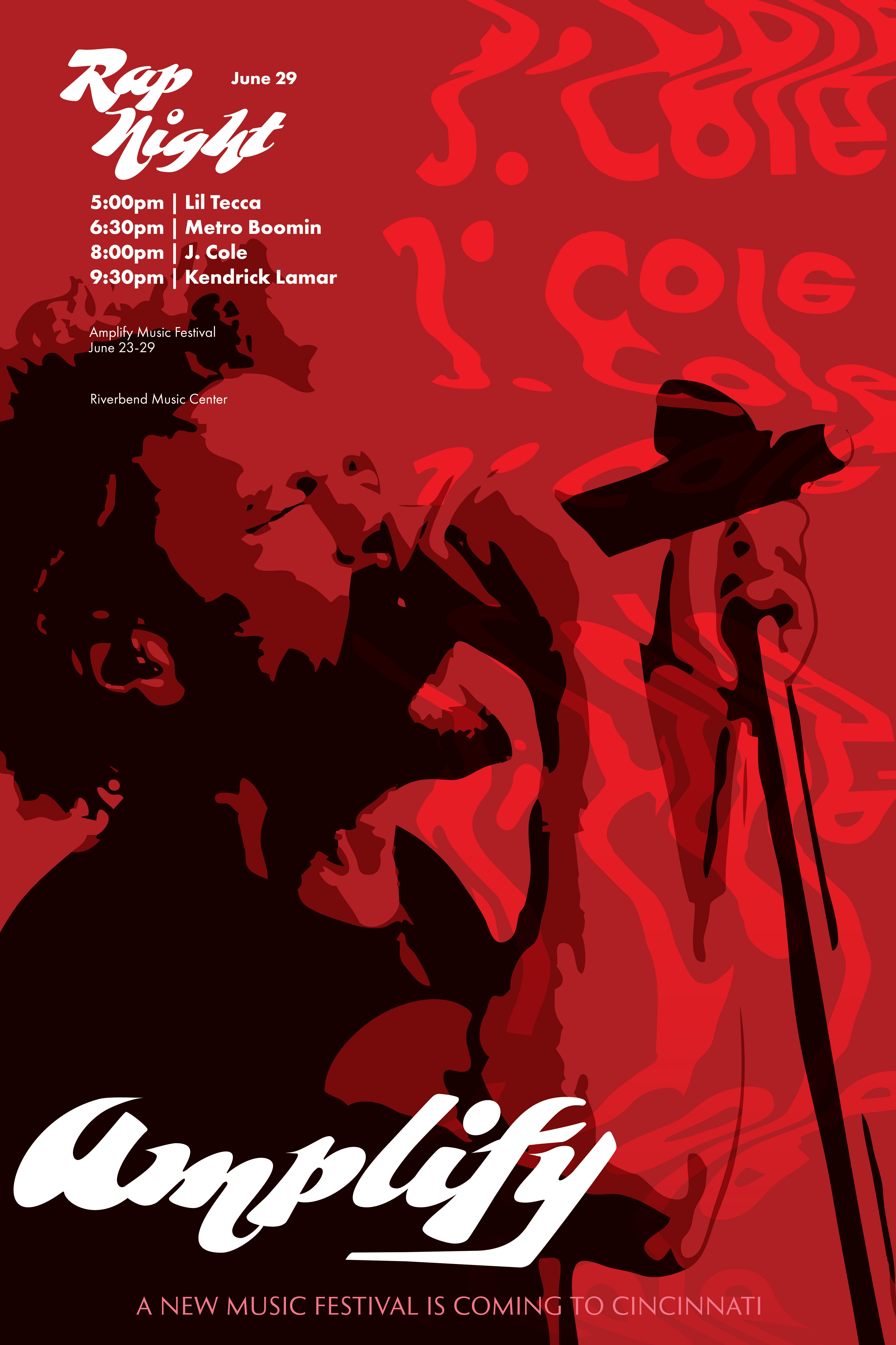
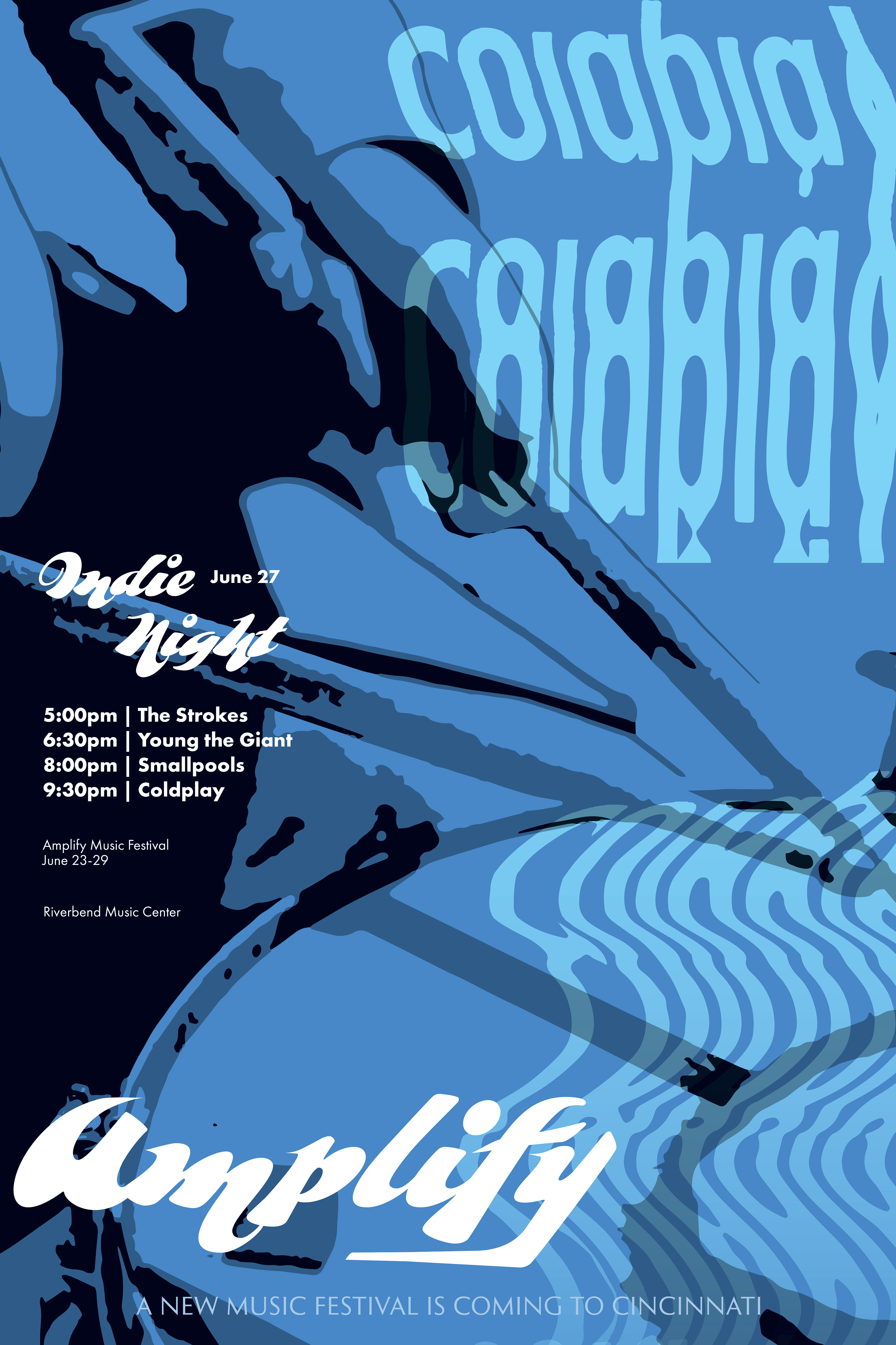
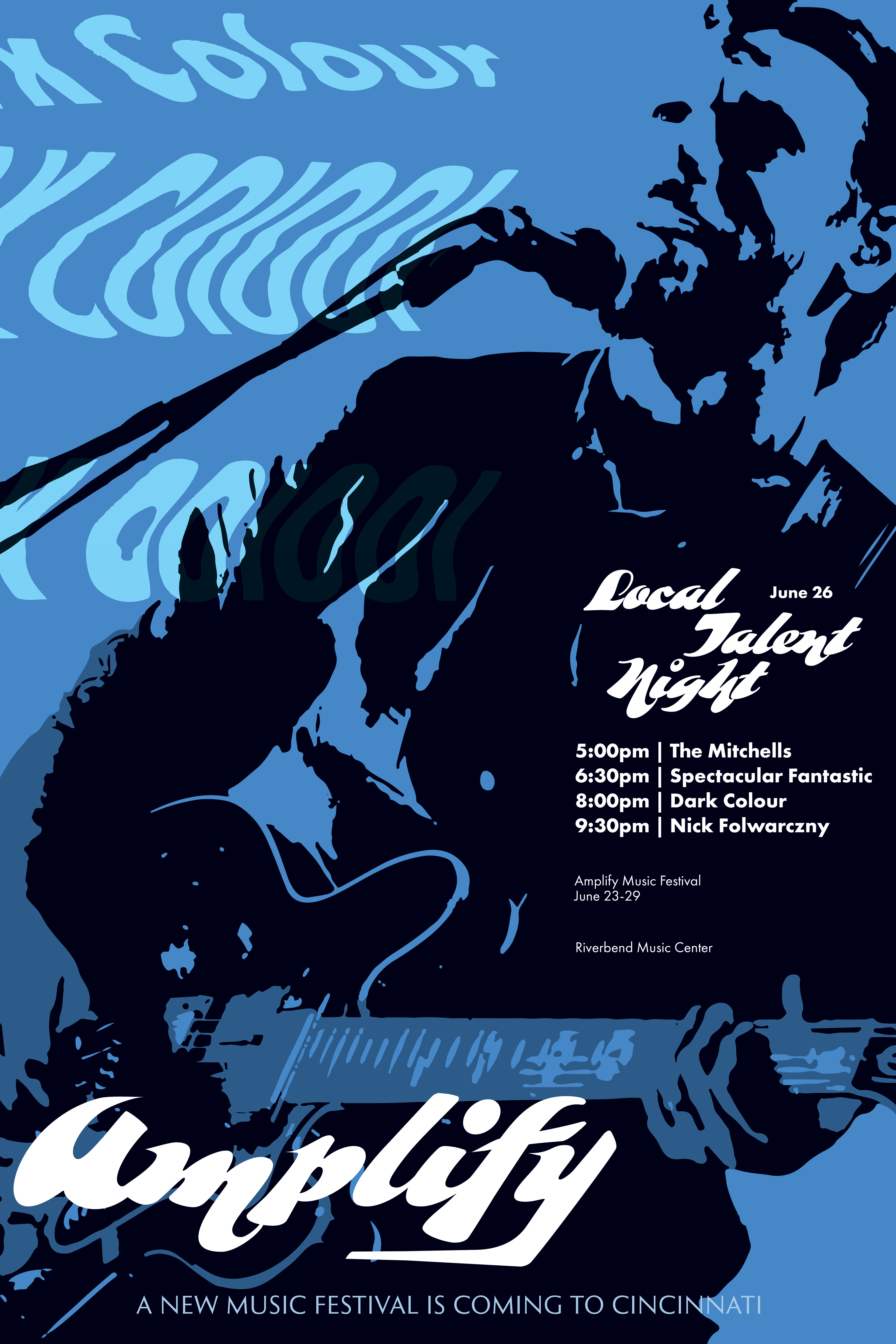
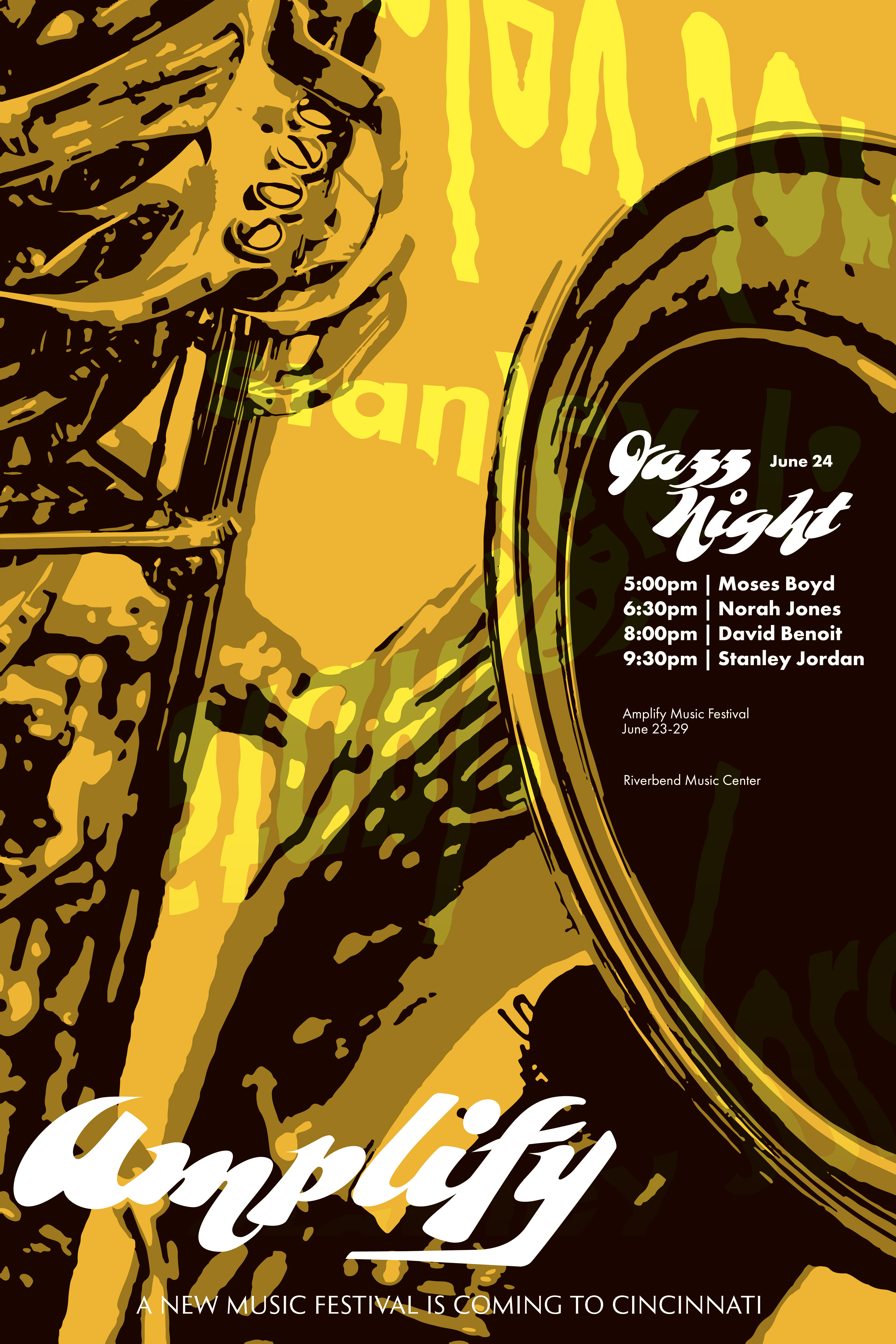
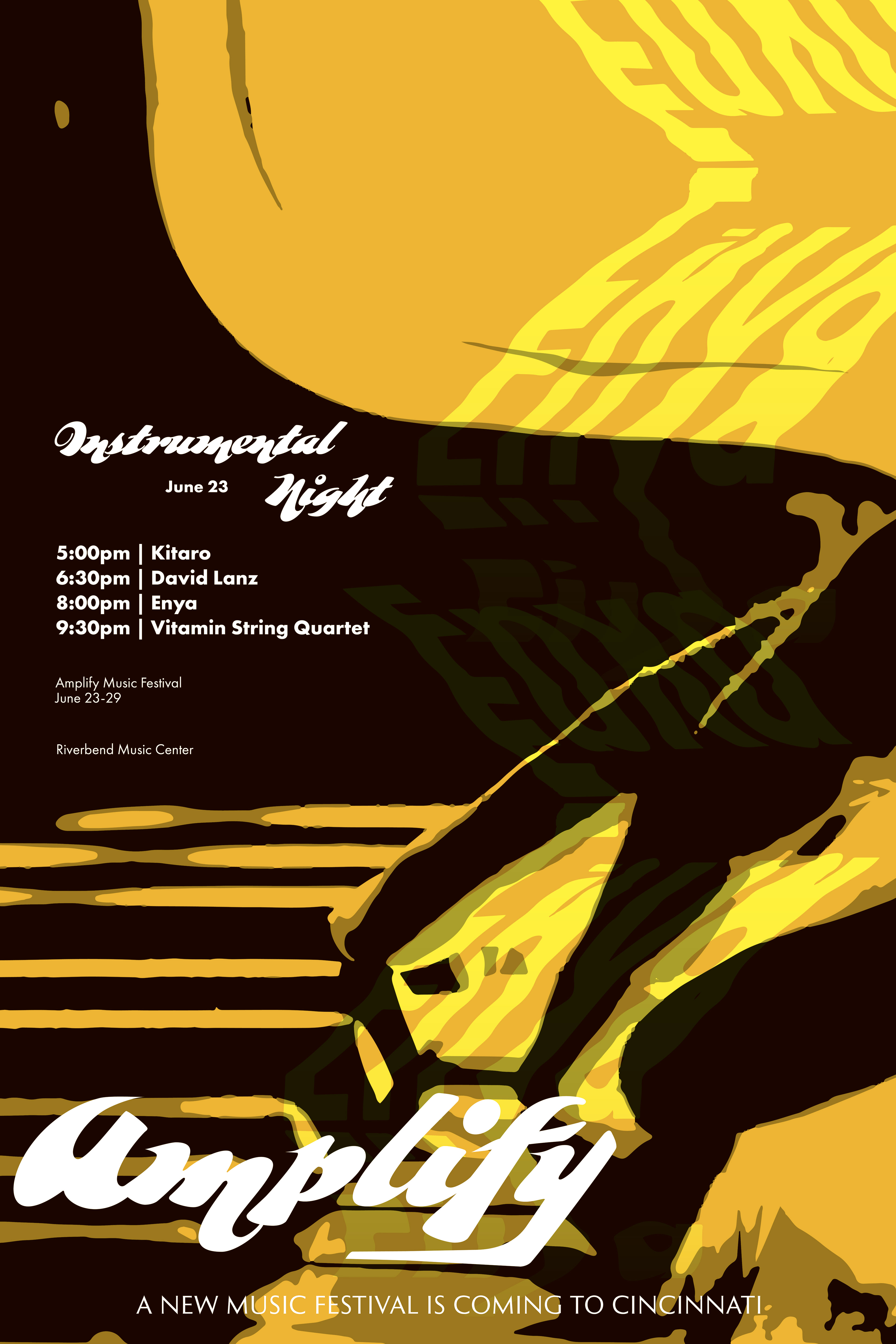
The final poster series made use of the same graphic elements in each poster but made use of different images that related to the theme or music genre of the night. With Amplify being a week-long event, each night would have a different genre as the focus being highlighted. The posters are united as a series by the imagery and use of text and are united in pairs by color. The striking colors of red, blue, and yellow catch the eye with the images and provide intrigue from viewers.
Website UI Designs
The first UI design was a homepage that communicated what the event was and who some of the artists would be. The same images were used in this website to continue the branding campaign and tie it into the poster. One feature that is intended to be a draw for viewers is that this festival features not only mainstream artists but also rising local talent who are up-and-coming in their music careers. Emphasis was put on this by featuring the local talent with the headliners in the banner image when announcing the lineup.
A press page was also designed as a furthering of the UI system. Providing a site design that would inform the press and people about the assets and information for the event was an important element to highlight as the resources accessible on the page would help spread information about the event in publications.
Social Media Posts
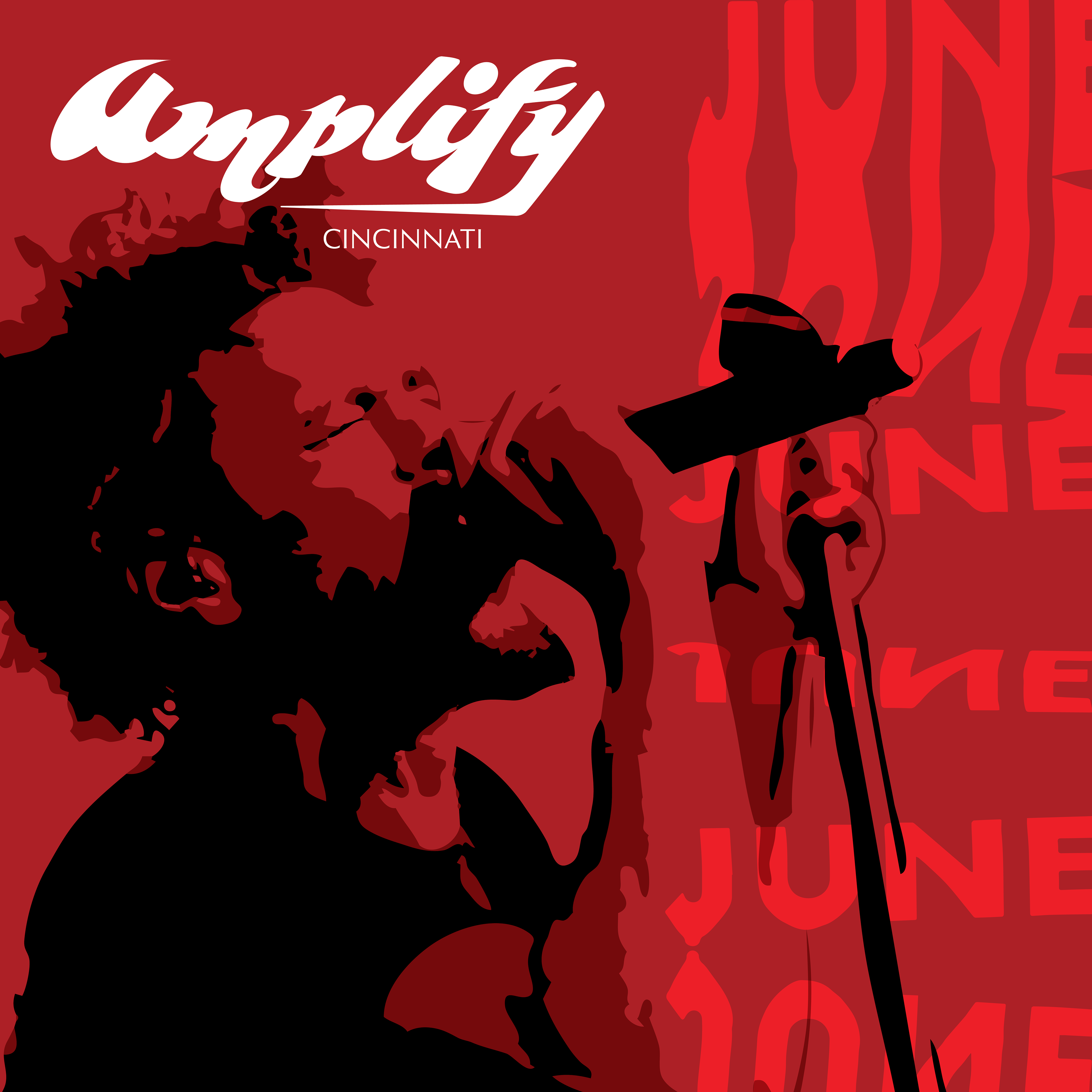
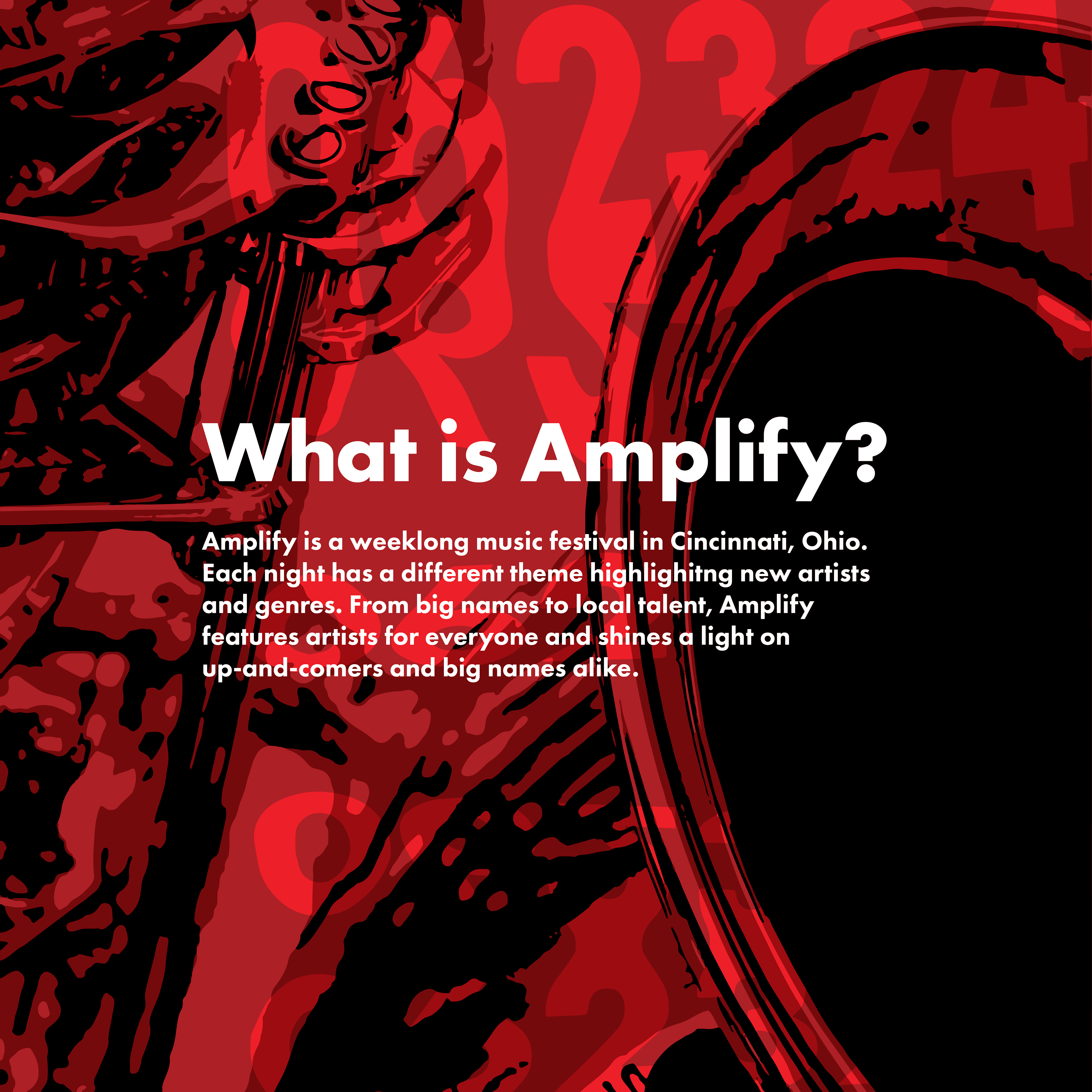
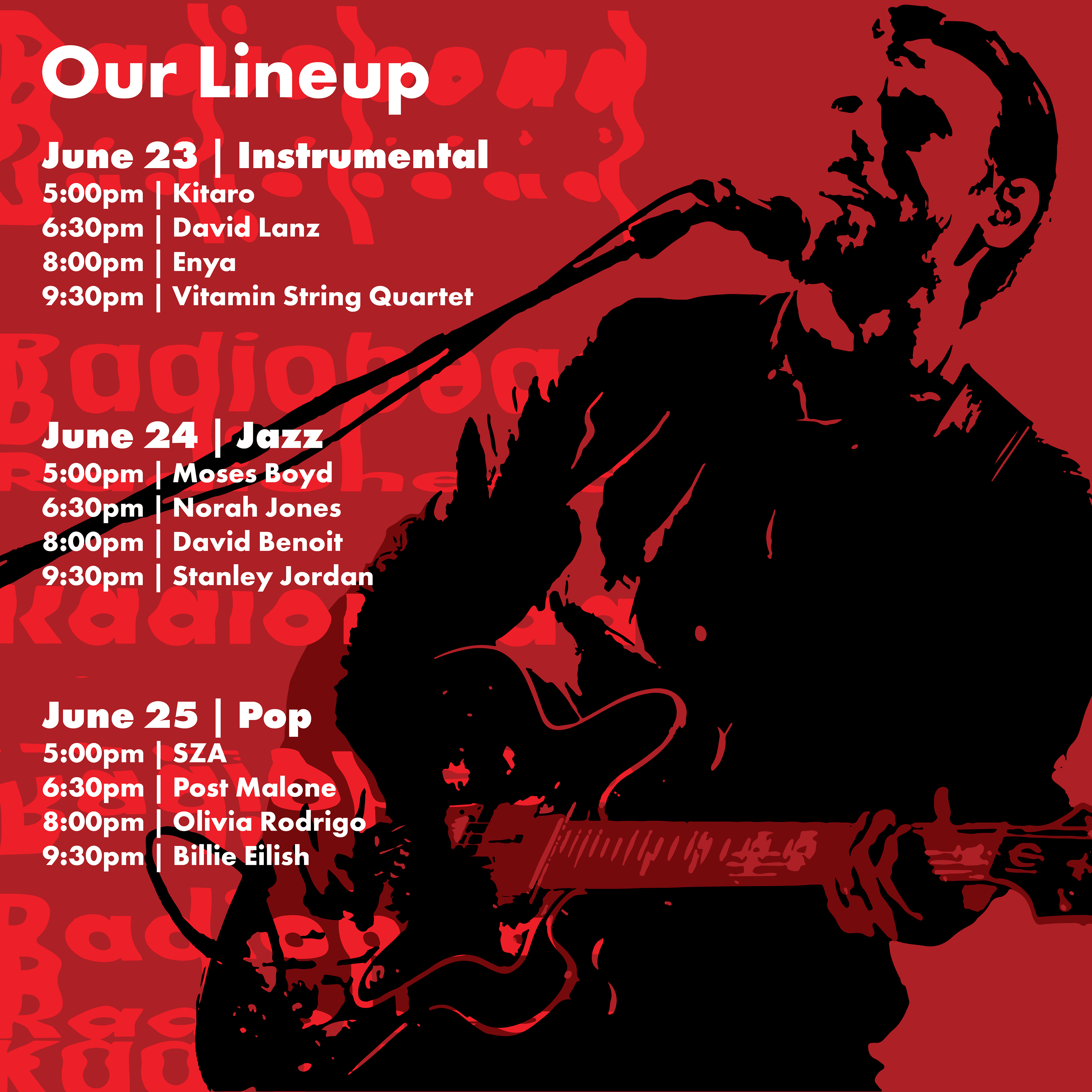
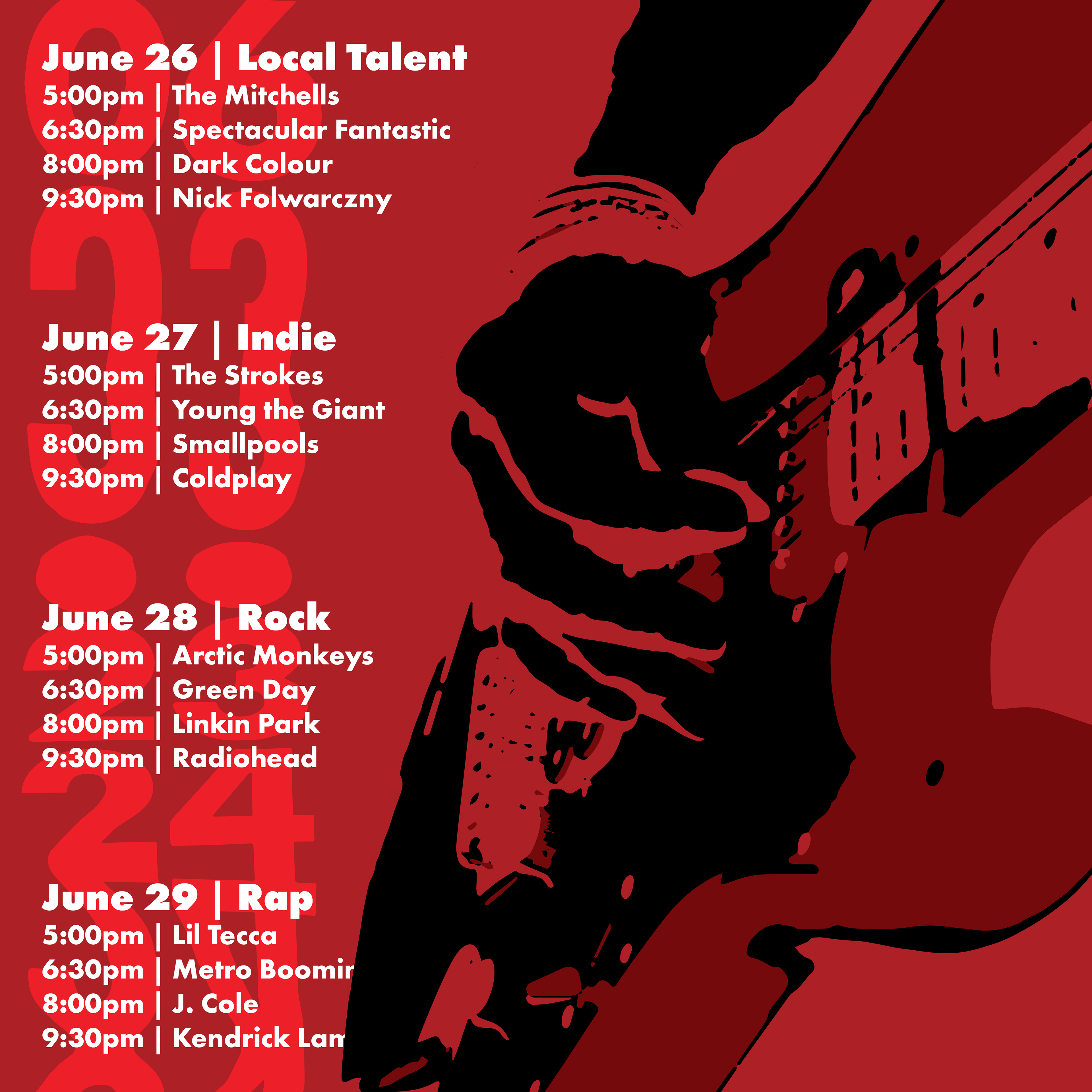
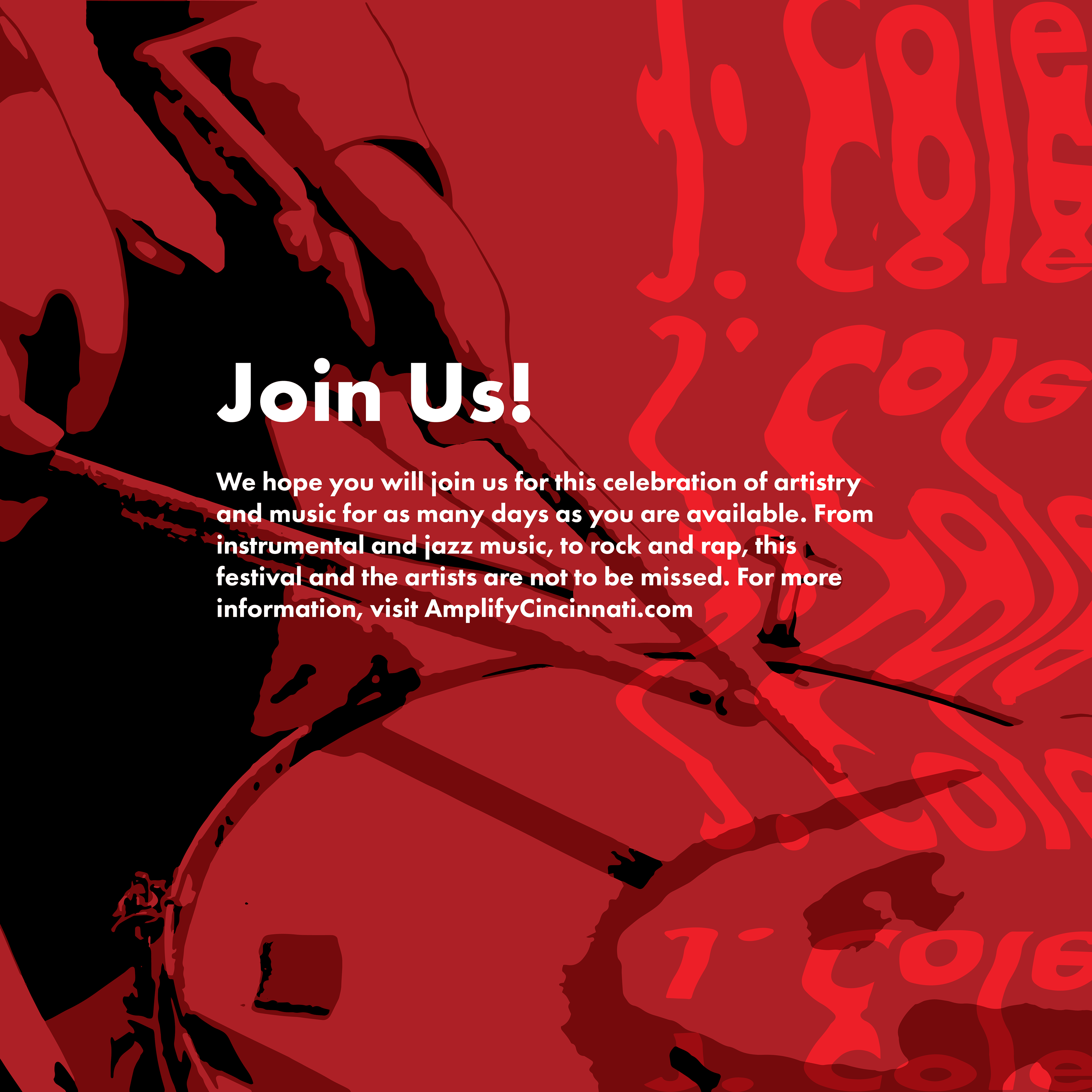
The fourth step in the branding campaign was a series of social media posts. These images are meant to be posted all together and convey the necessary information about the event to users on any platform. First, an engaging cover image was created to draw viewers in, followed by a slide that informed users about the event and what the goal was. The next two images show the lineup and musical genre for every day of the week to excite readers when they see an artist they are a fan of. The final image in the post includes a call to action for viewers to attend the event and learn more at the website.
T-Shirt Merchandise Design
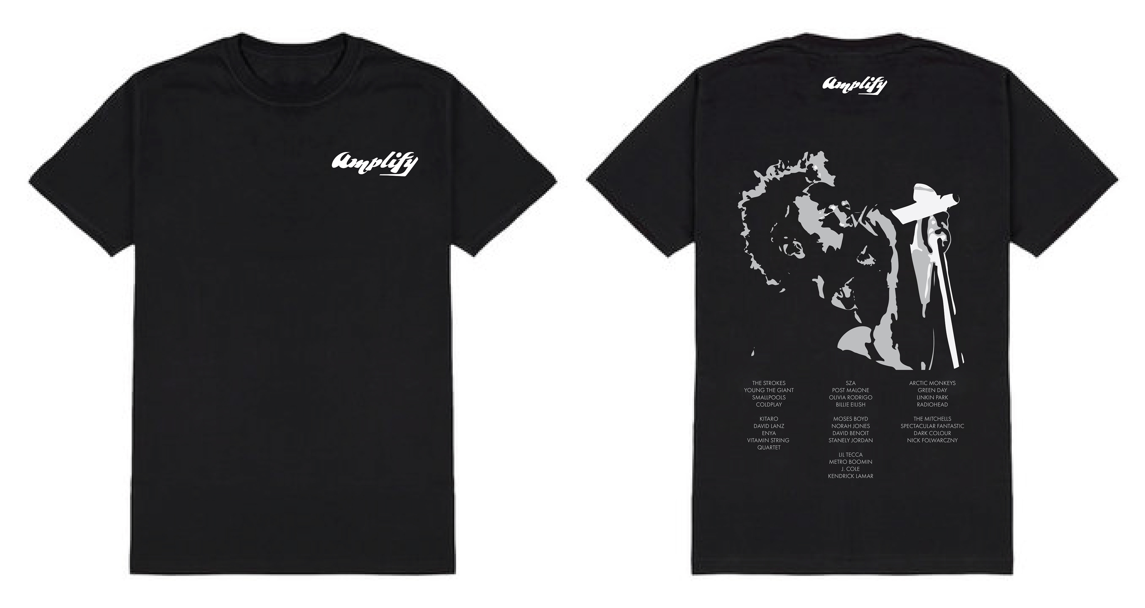
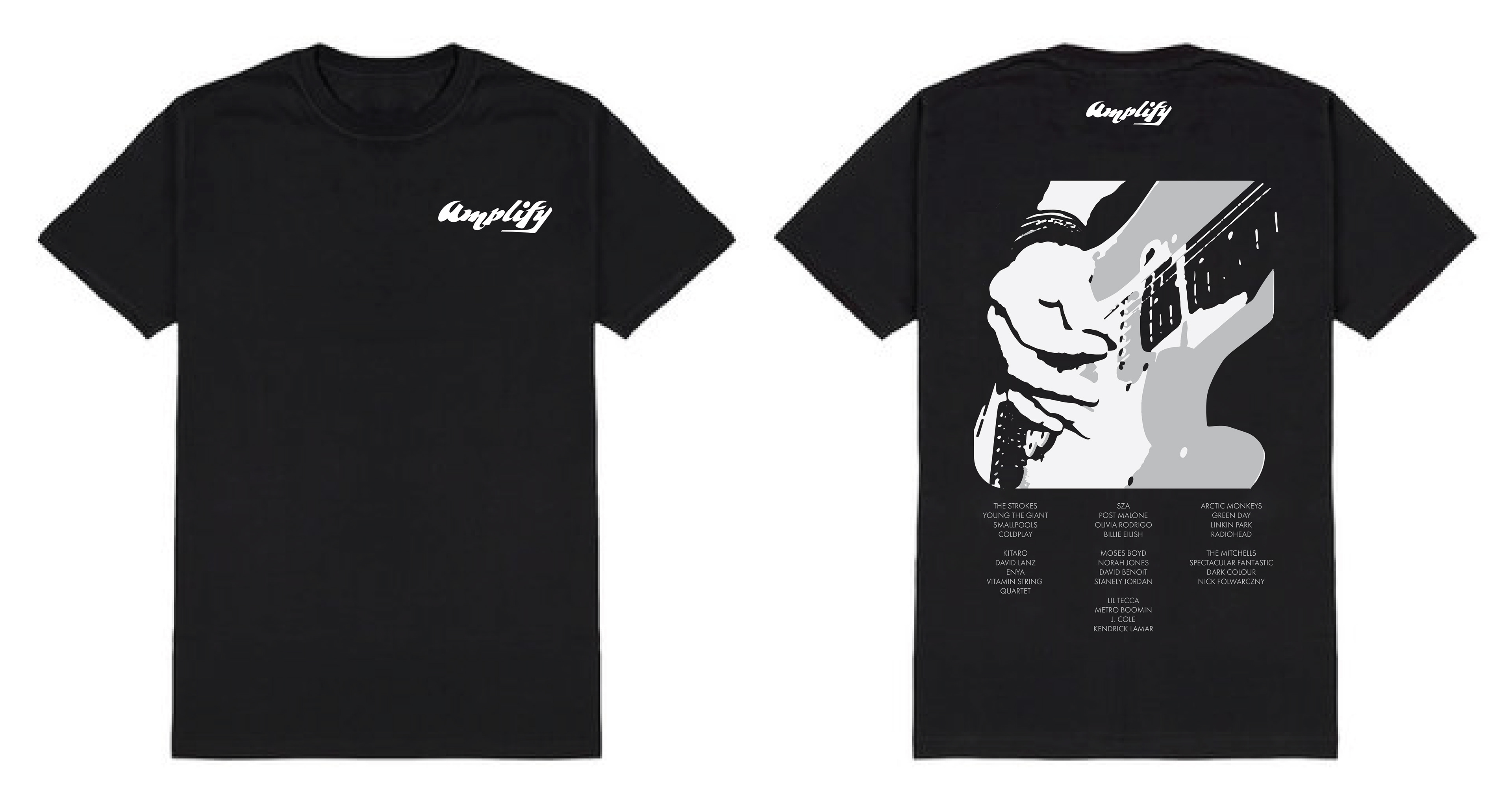
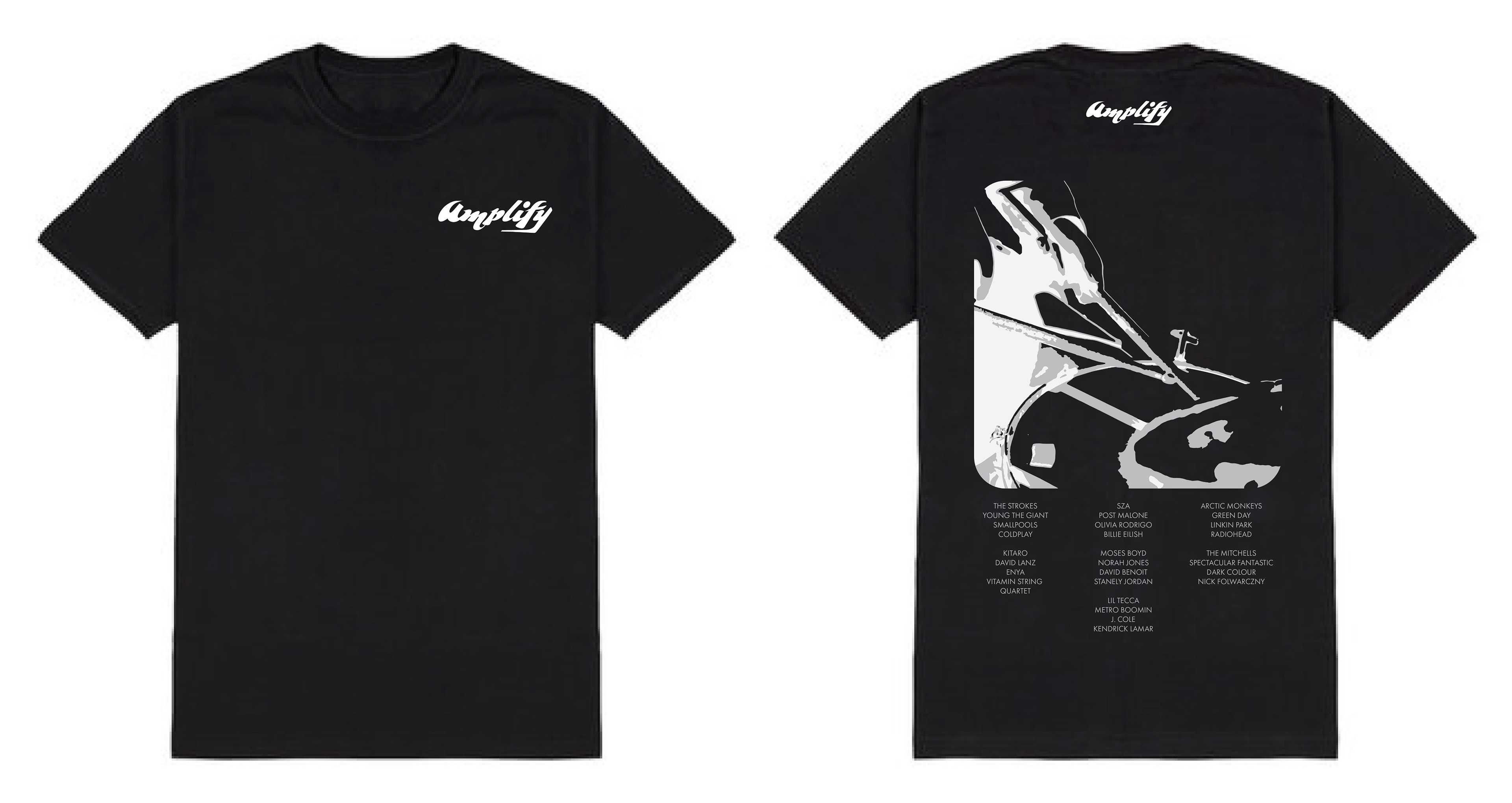
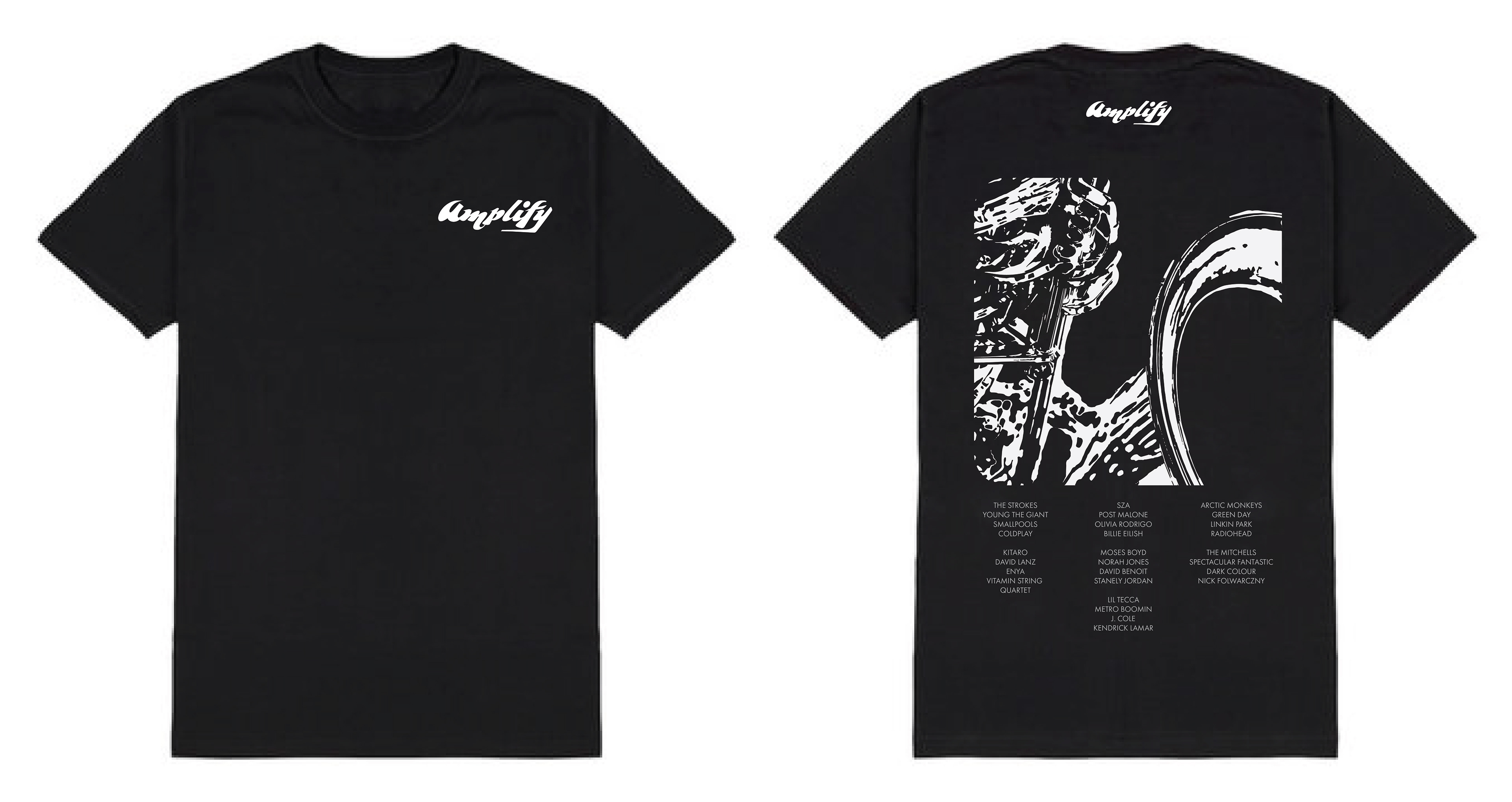
Merchandise was also created to provide a product that people who attended the event could buy. Making use of the stretched text effects and imagery, the designs tied back into the posters, website, and social media posts, while being combined with a list of some of the major artists from the festival. This final piece in the branding campaign provides the target audience with something to take home after the event.
Mobile Phone Ticket Design
The final piece in the branding campaign was a ticket design that would be scannable from festival attendee's phones. The stretched text was used on the side as a decorative feature while the body copy information for the event was played over the imagery that related to that night's genre. The QR code was placed unobstructed in the center aligned horizontally on the screen to allow for easy scanning to enter the festival.
