Objective
Apply typographic theories and principles to assess a magazine design system and explore typography through identity development. Considering form structure and style, create a wordmark for a magazine that communicates meaning and begins to build a visual language.
This project was designed for the cultural magazine, "Freestyle," which focuses on hip-hop music and the culture that surrounds it.
Typefaces
The typeface used for the final wordmark was Degular Display in Black weight. This specific typeface and weight were chosen because it captured the bold, confident, eye-catching style that rap music is known for while maintaining legibility.
Creating the Wordmark
In order to give the wordmark an active appearance while maintaining the confidence of the original typeface, most of the changes were small and provided consistent elements between letters. An apostrophe was added before the "f" and the other apostrophe mark was integrated into the y to make it look like a quote or an outlying piece within the word like an ad-lib in a rap song.
Final Wordmark
The angles chopped off the top of the t and l match the angle of the s which is mirrored in the ends of the e's. The front end of the f was lined up with the apostrophe as well. This addition and repetition of angles complemented the flat ends of the other side of the f, r, and t. Creating a rhythm and alternation between angles and flat sides was the end goal of the design.
Creating the Spreads
The first two spreads were prioritized to create a system that could work across the rest of the publication. Text and images were moved around constantly to find better placements and create cohesion throughout the spreads. Eventually, the rotated text, broken-up images, and the graphic stretched text were chosen as the consistent elements across each spread.
Table of Contents Process
The first drafts of the table of contents were created before the red color and shifted elements had been finalized, but once the elements within the main spreads had been completed, they were implemented into the table of contents. This provided consistency across the magazine and a cohesive style.
Magazine Cover Process
The final element to be created for the magazine was the cover. The shifted elements and red color were applied to the design to make the page stand out if it were on a shelf for purchase. The main difference between the cover and the spreads is the text detailing the articles within is the conventional orientation, allowing for easier reading when on the shelf to know what is within the magazine, as well as make the rotated text more confronting to readers later.
Final Spreads
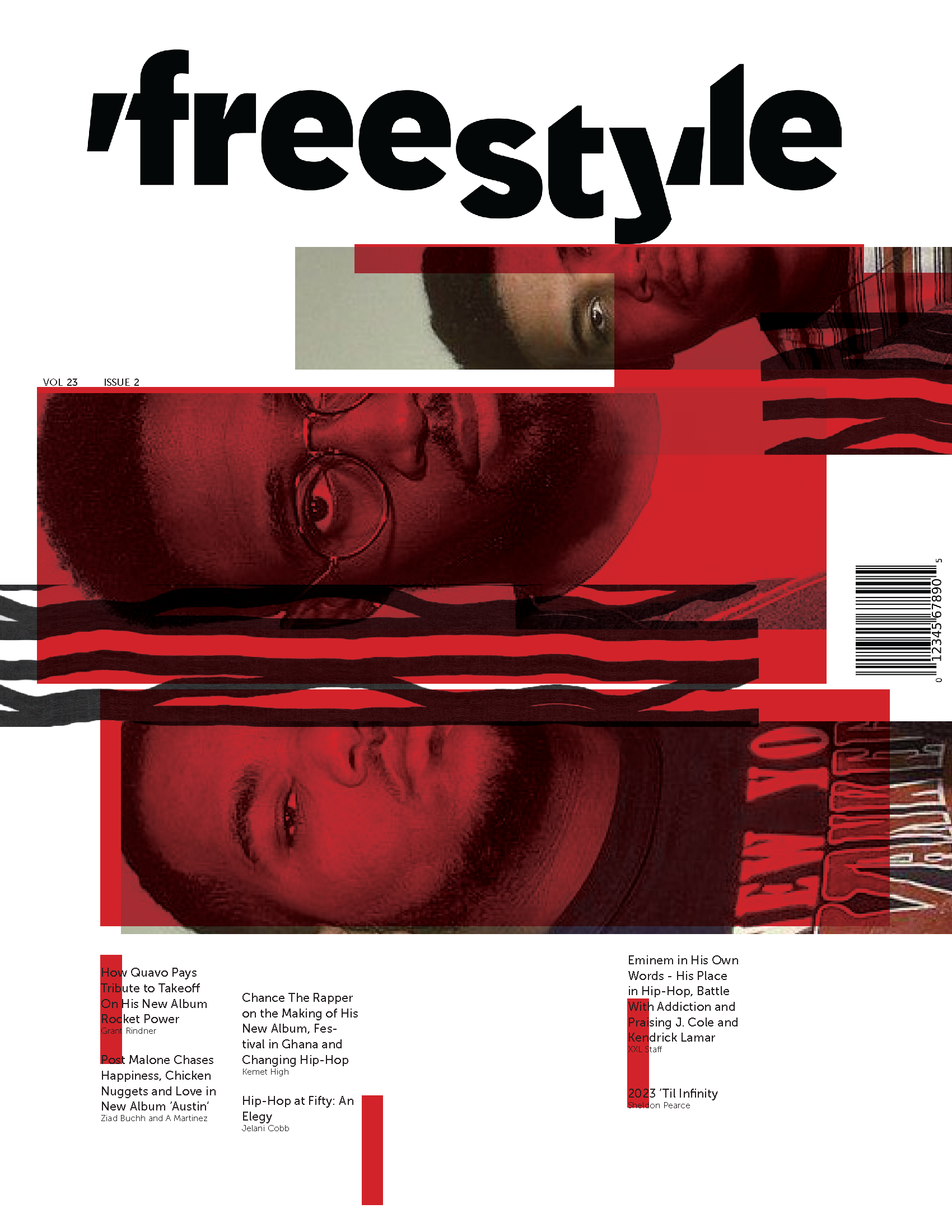
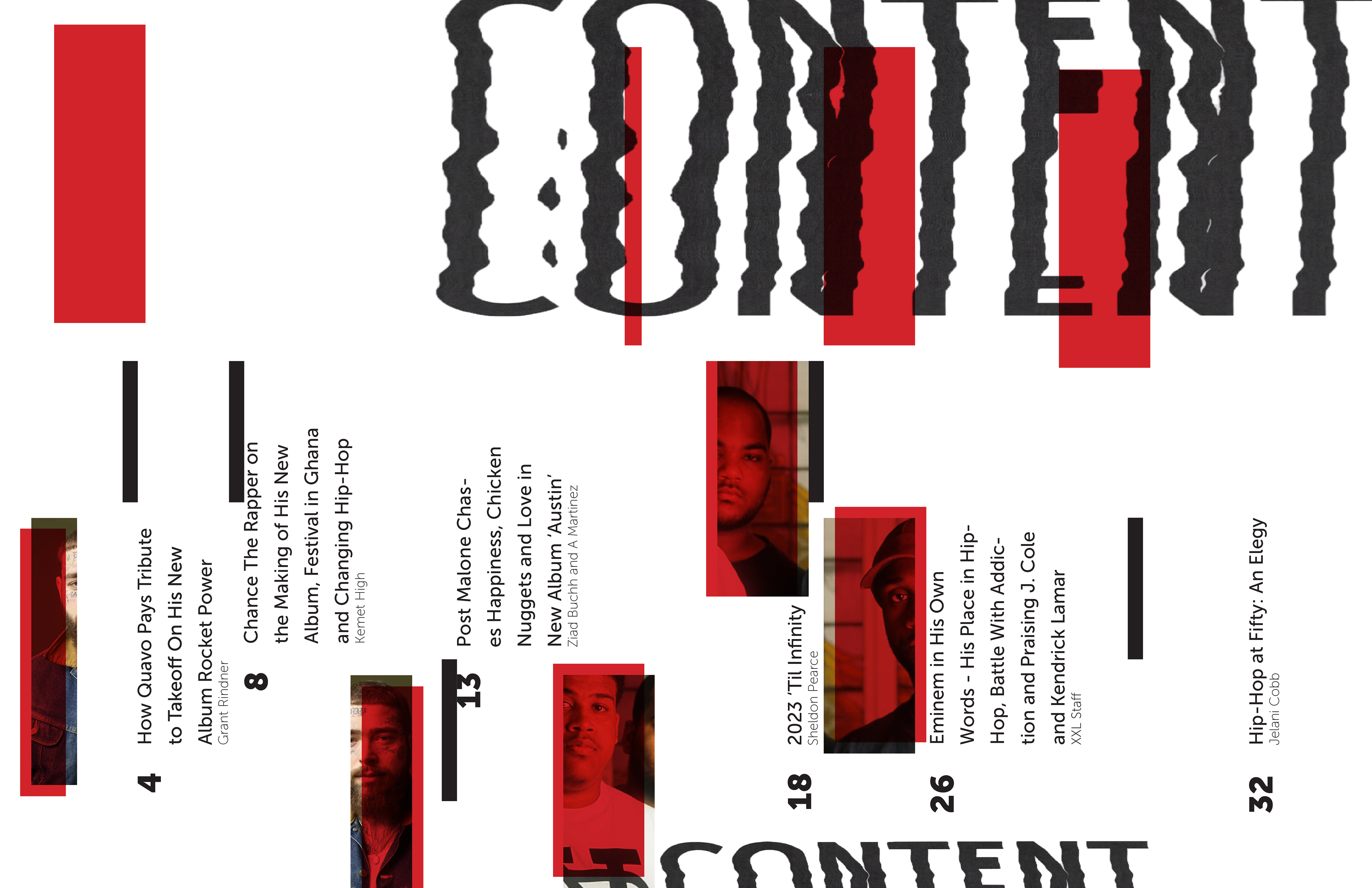
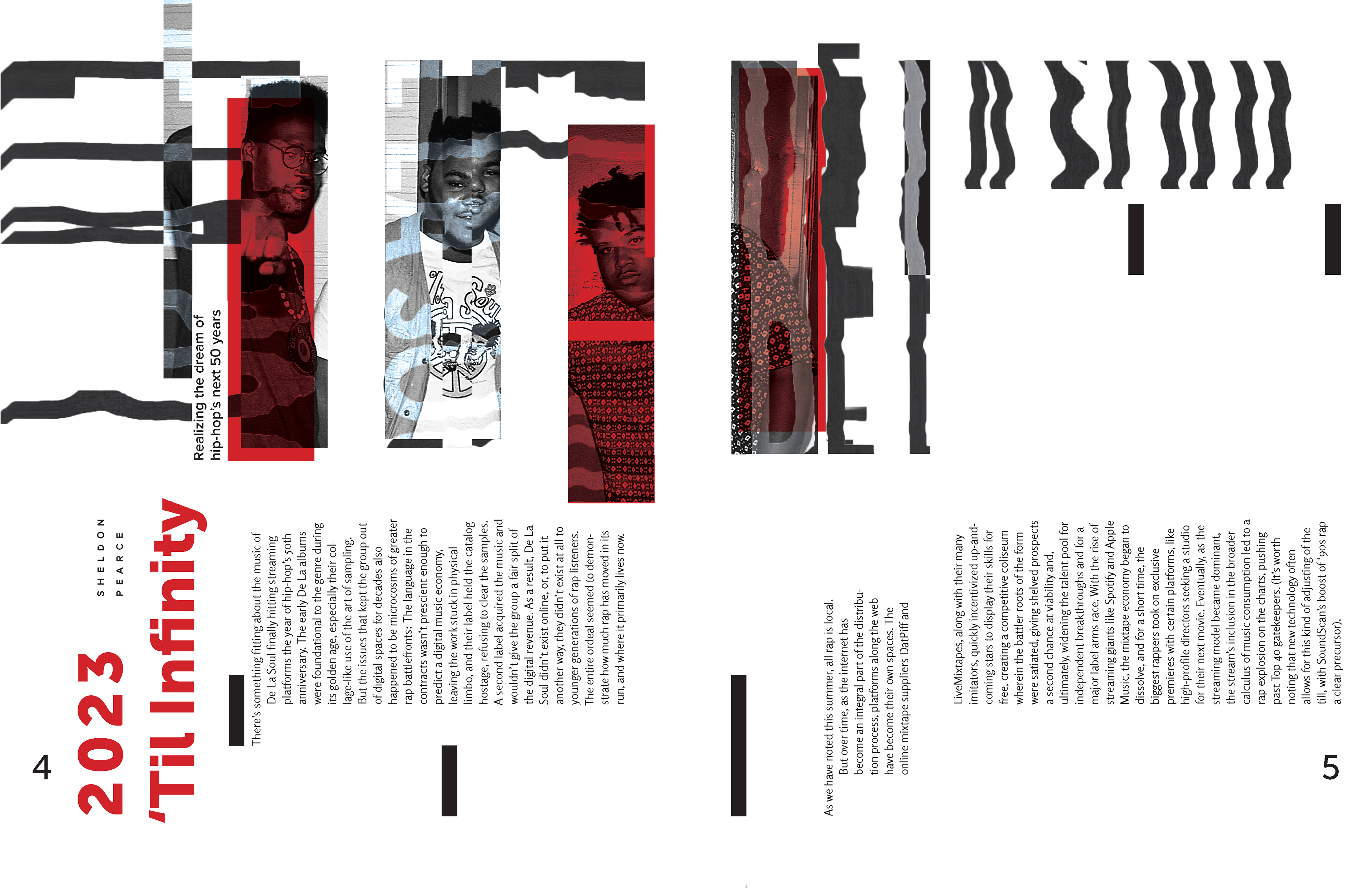
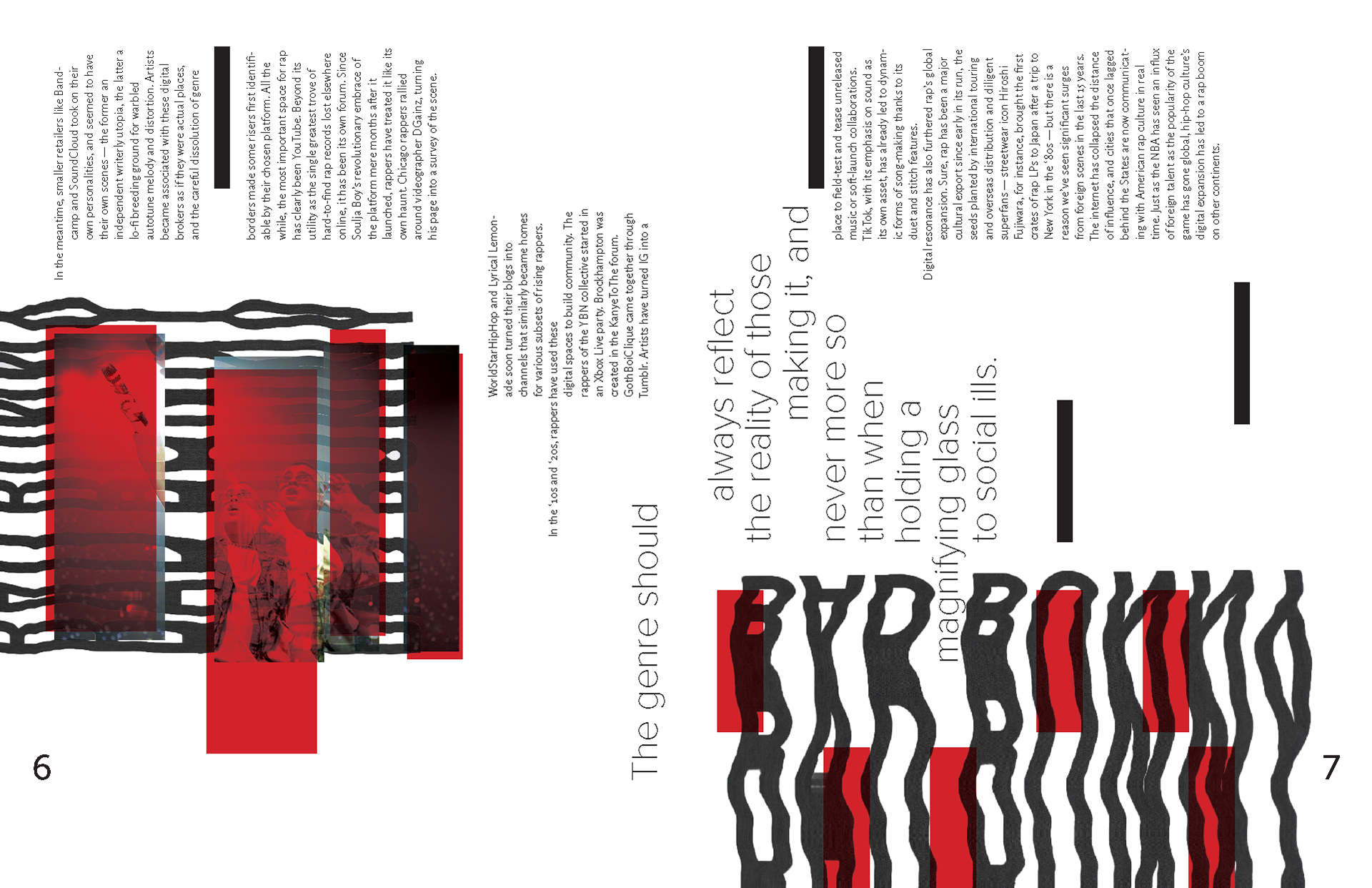
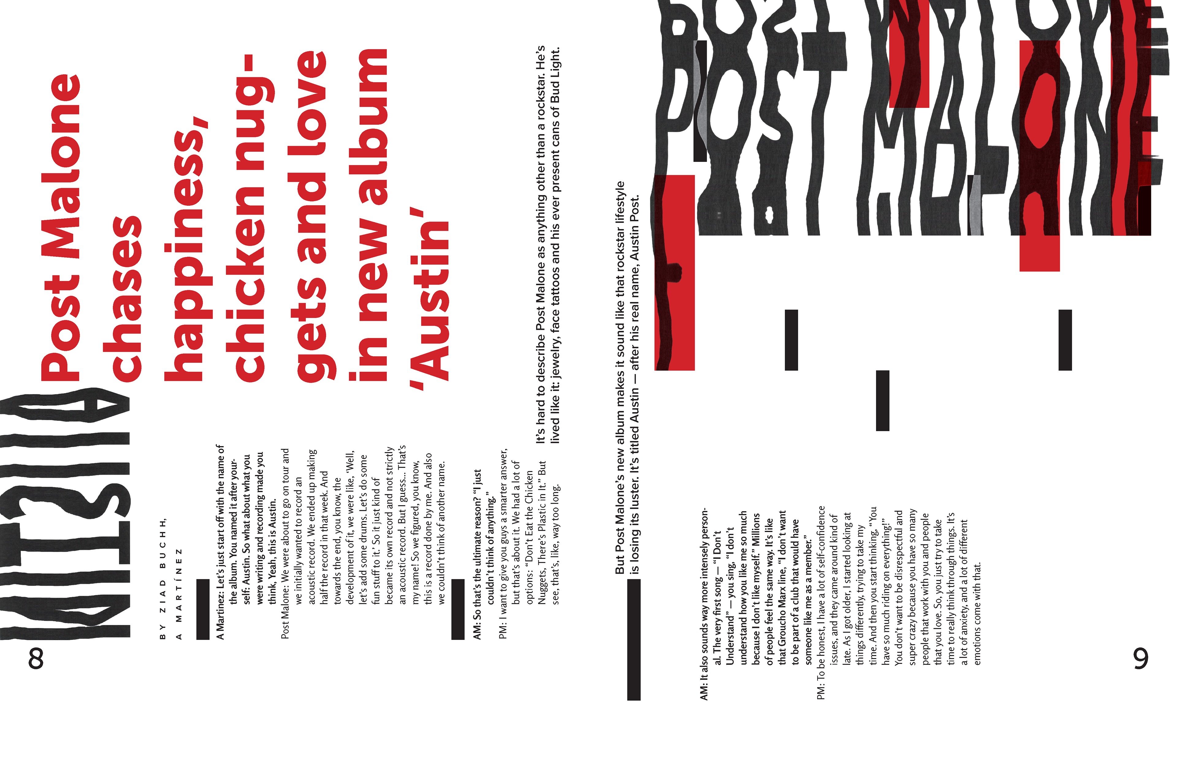
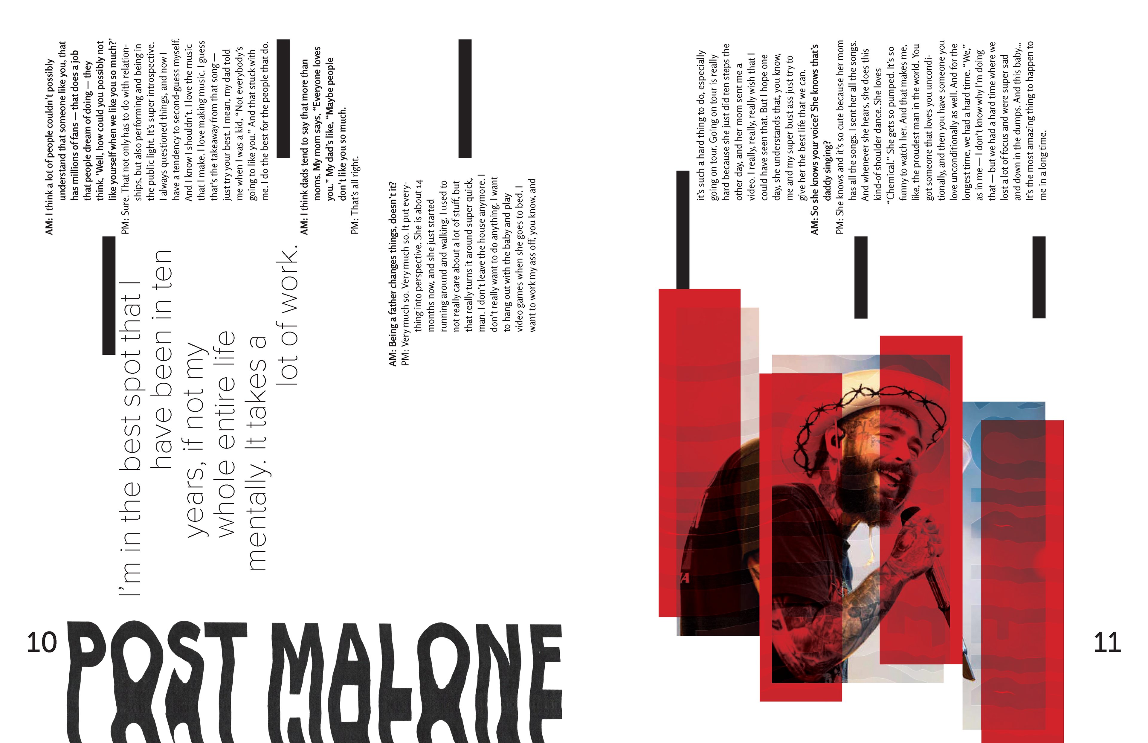
The final spreads provided a cohesive system that kept elements from the wordmark while also relating to the subject matter. It confronts readers in its format like the music itself would, and is loud and bold to catch the attention of readers as well.
