OBJECTIVE
To redesign a brand identity and visual system that can be applied to various formats. To communicate the event information clearly. Organize information into a clear and recognizable hierarchy.
Current Branding
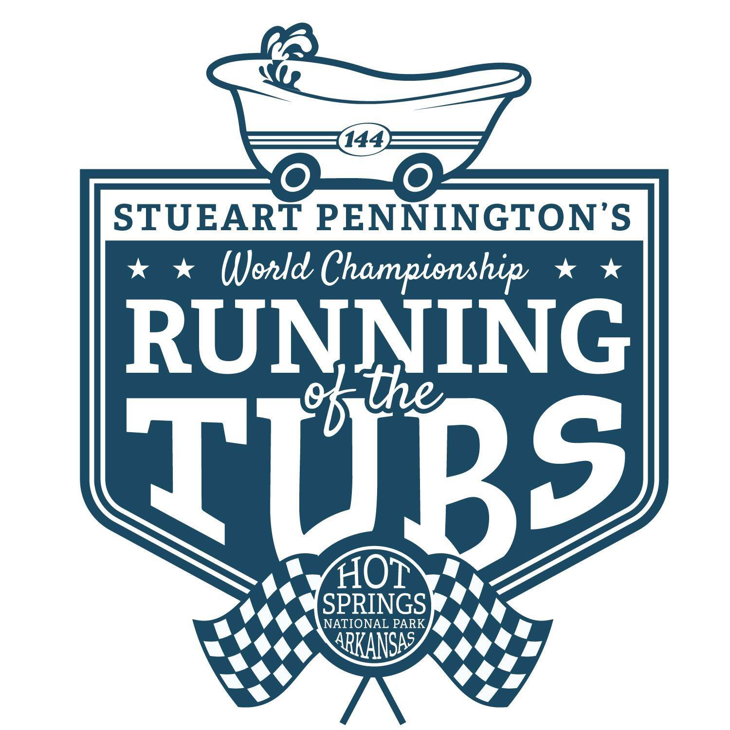
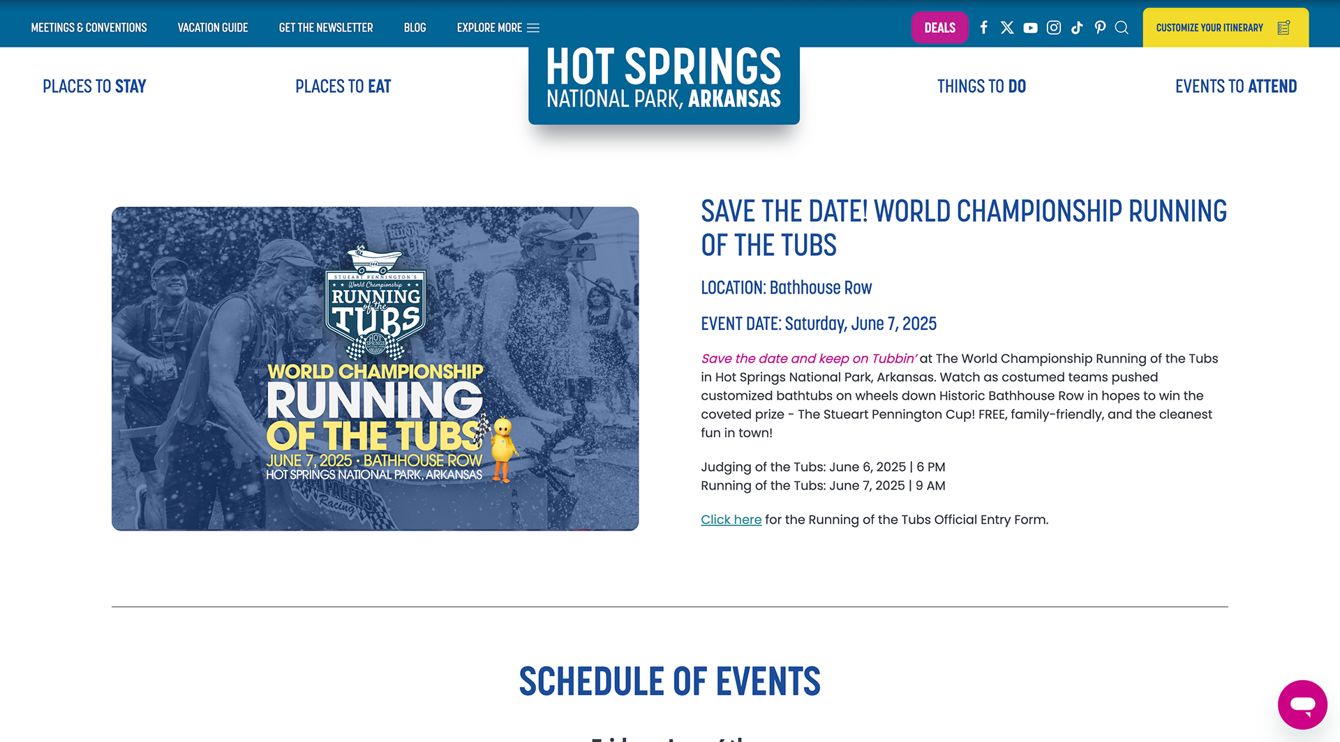
Their current branding doesn't have much further application beyond the logo on their Facebook page, and they don't have a website of their own to share information.
Brand Typefaces and Colors
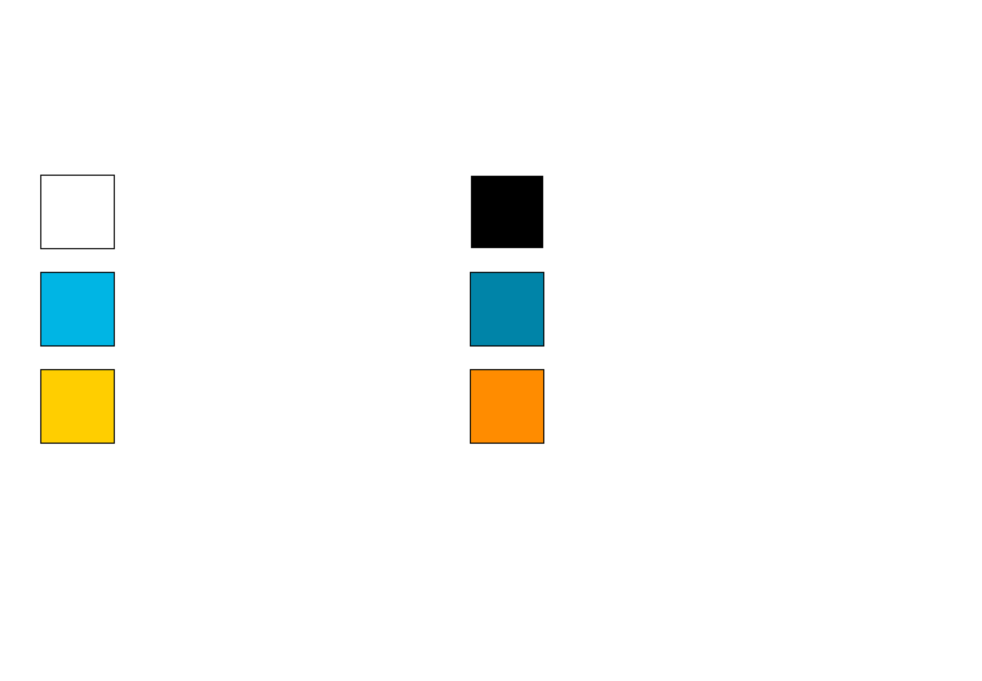
The foundational elements of the brand, type and color, were chosen off of a desire to be simple and easily legible for the type, and to tie into the idea of baths and bathtubs with the selection of the blue colors. Yellow and orange were added as an accent to remind audiences of rubber duckies.
Primary Logo
The primary logo focuses on the shape of the bathtub and soap bubbles while placing the name within the tub itself. Keeping the bathtub idea from their current logo while shortening the title and simplifying their logo overall was the main goal for the logo redesign.
Secondary Logos
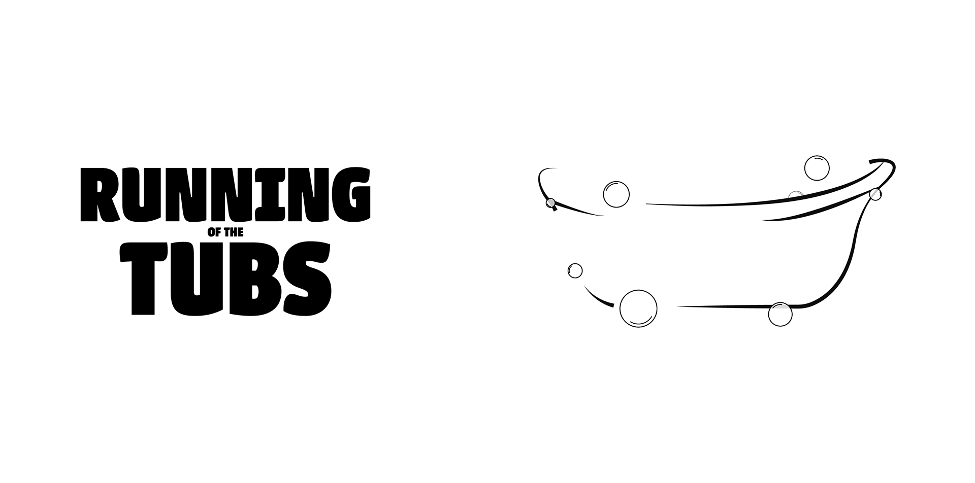
Providing two alternates to the primary logo helped provide a wordmark for the event as well as the simple bathtub shape for branding applications.
Website Homepage
First a website homepage was created to give the event it's own space to publish information and tell people about the event. An image from a previous race on their Facebook page was used as a banner image in the background.
Tote Bags
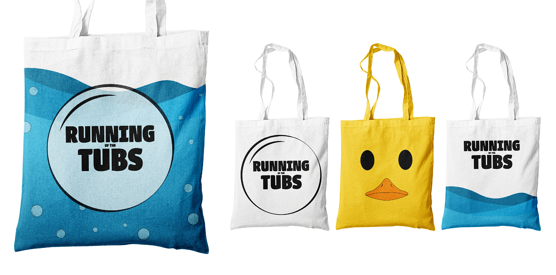
Multiple variants of tote bags were created to provide attendees with options. The primary tote bag, with the bubble over the waves, along with some secondary options such as just the bubble, water, and then an all-yellow tote bag featuring a rubber duck that would be similar to the mascot for the event.
T-Shirt Designs
T-Shirts were also created with a plain white shirt featuring the logo and wordmark as well as a shirt featuring the rubber duck mascot from the tote bag again.
Billboard
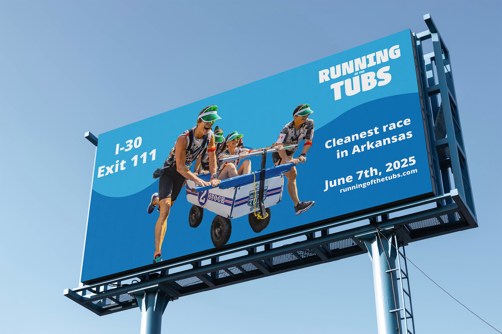
The fourth step in the branding campaign was a billboard to attract tourists on the highway in Arkansas. Featuring another group of racers from a previous race, the highway exit, date, and the tagline "Cleanest race in Arkansas" to make viewers more interested in attending.
Postage Stamp Design
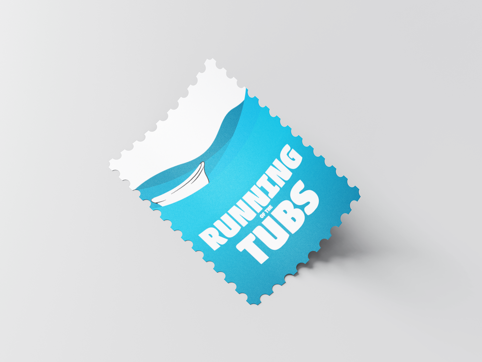
A limited-edition postage stamp was also created to make people aware of the event or have another way to commemorate the race.
Trophy
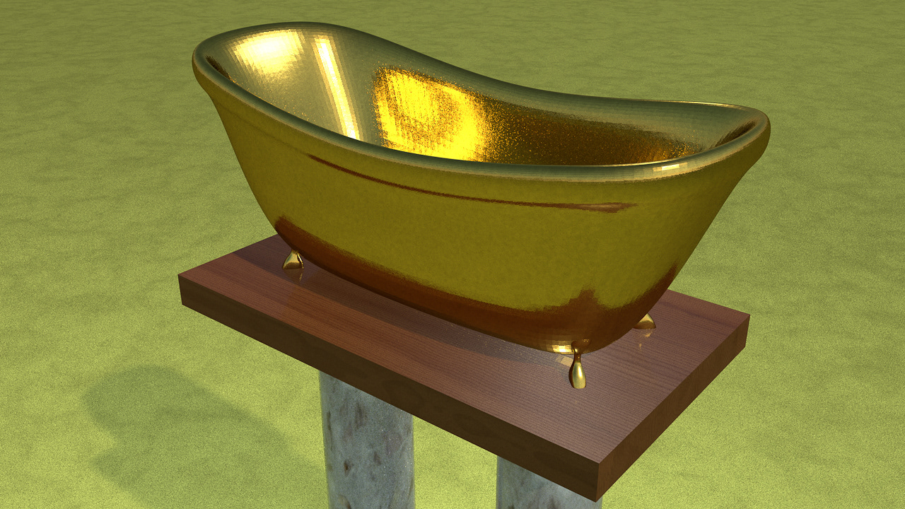
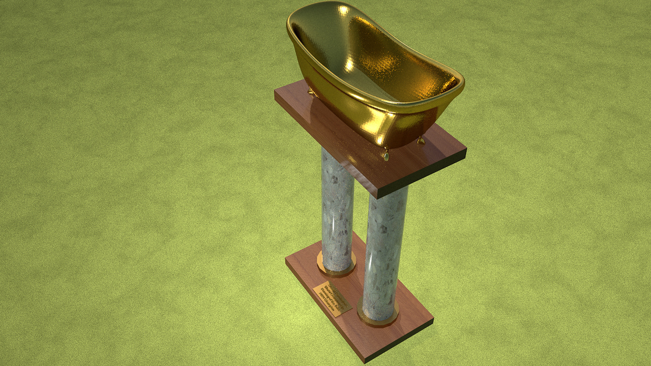
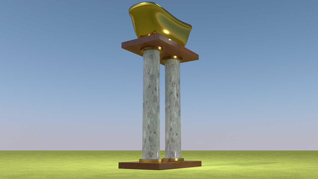
The final design piece of the brand refresh was a trophy for the winner of the race. The trophy features a golden bathtub on a wooden base supported by two pillars with a plaque on the bottom that would display the winners' names and the category they won at the event.
